The bar includes a button to help you find and edit items in your layout editor. This includes blocks, rows, columns, or widgets. Click the arrow to enter inspector mode, and each item you hover on will be identified by color and will include an edit link in each corner. See this video demonstration:
Inspect blocks, rows, columns, and widgets
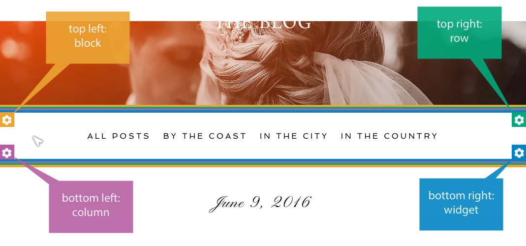
Hover over different parts of a page while using inspector mode to highlight layout items. They will show one or more border colors & edit buttons. The color tells you which item you are hovering over, and an edit button will appear in one of the corners.
Here is an example of a navigation menu widget which sits in a column/row/block that has no padding applied. In this example, all four borders and edit buttons are seen because they all exist within the same space on the page:
Use the inspector arrow cursor to click any of the four edit buttons, and you will be taken to that particular part of the layout editor in the proper template, demonstrated in this video:
You can edit the layout item right there in your editor screen.
- For yellow block items, find the edit button in the top left corner
- For green row items, find the edit button in the top right corner
- For purple columns, find the edit button in the bottom left corner
- For blue widgets, find the edit button in the bottom right corner
If you are viewing a very tall item, be aware that the edit button might be outside the view of your browser, so scroll up/down the page to find the edit button.
Filter the layout items
Use the filter checkboxes to limit the layout items you can select. For example, if you only want to hover and edit column layout items, you can uncheck other types and see only your layout columns, demonstrated in this video:
Using the filter option can make inspecting less busy or confusing when you know which layout item type you’re looking for. A common choice is to leave only widgets selected so that you can find and edit the content of your template on the page.
The bar includes a button to help you edit or replace background images which are used in the page you are viewing. Click the button to display all backgrounds used by the current template you are viewing, demonstrated here:
This will find images that are applied to your template, but will not list background galleries.
First in the bar is a breakpoint helper. This helps you review your site at different display sizes, which each correlate with controls in ProPhoto. There are four breakpoint sizes where ProPhoto can show/hide parts of your design, or change the layout or styling of your content.
 Using the responsive options that ProPhoto provides, you can use breakpoints to affect your design in various ways. The ProPhoto bar helps you identify the breakpoint width you are currently viewing in your browser so you can resize to check each width.
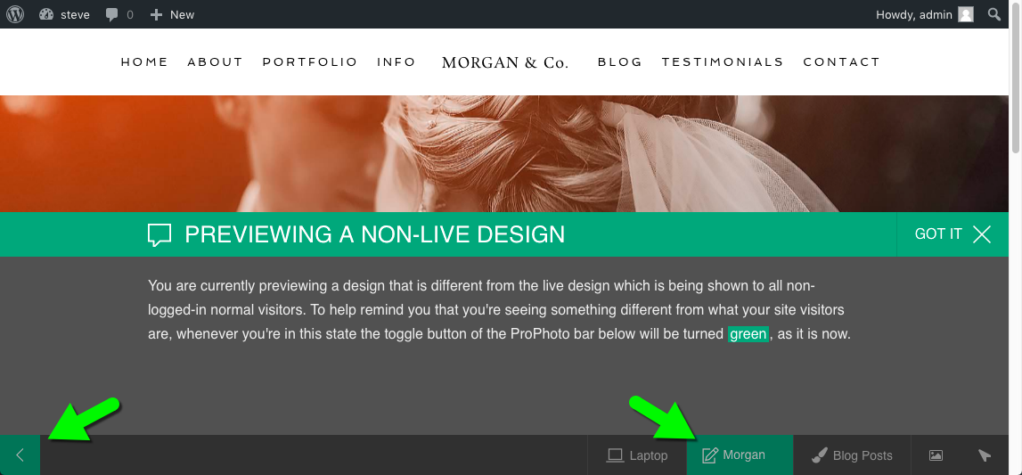
The bar also tells you the name of your ProPhoto Design currently being edited.
You may use the selector to choose a design and work on/preview it privately. Your original ProPhoto 6 design remains to be seen by visitors who come to your site, but you will see and edit the new design.
green highlights indicate when a design is being edited privately
For more information about privately previewing designs, see our Create and Manage Designs
page.
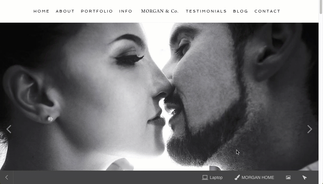
The bar includes a button to tell you which template is being used for the page you are viewing. The button behaves as a link to the layout editor so you can work on the template directly.
If you want to discover specific parts of a template, use the inspector arrow instead, explained above.