
Responsive website design is the standard for current and future web development. It ensures sites are easy to view and navigate for any visitor, on any device, at any browser window size. And for this reason, search engines rank responsive sites higher in their search rankings.
But what exactly does “responsive” mean? And what implications does it have for ProPhoto users, since ProPhoto is a fully responsive website building tool?
Responsive Sites
As the word implies, a “responsive” site is one that detects and responds to the window in which it is viewed. A lot of folks think this simply means that on large desktop monitors, images look huge, and on smaller mobile devices, the images shrink to fit. But a responsive site does a lot more than just enlarge and shrink images.
True responsive sites (like ProPhoto sites) also incorporate a concept called breakpoints. Breakpoints mean that at certain window sizes, content rearranges and/or modifies itself to provide the best possible viewing experience to the visitor on that window size. For example, imagine you are using ProPhoto and you have a page containing 4 grid images, side by side in 1 row, which looks great on a normal desktop window.
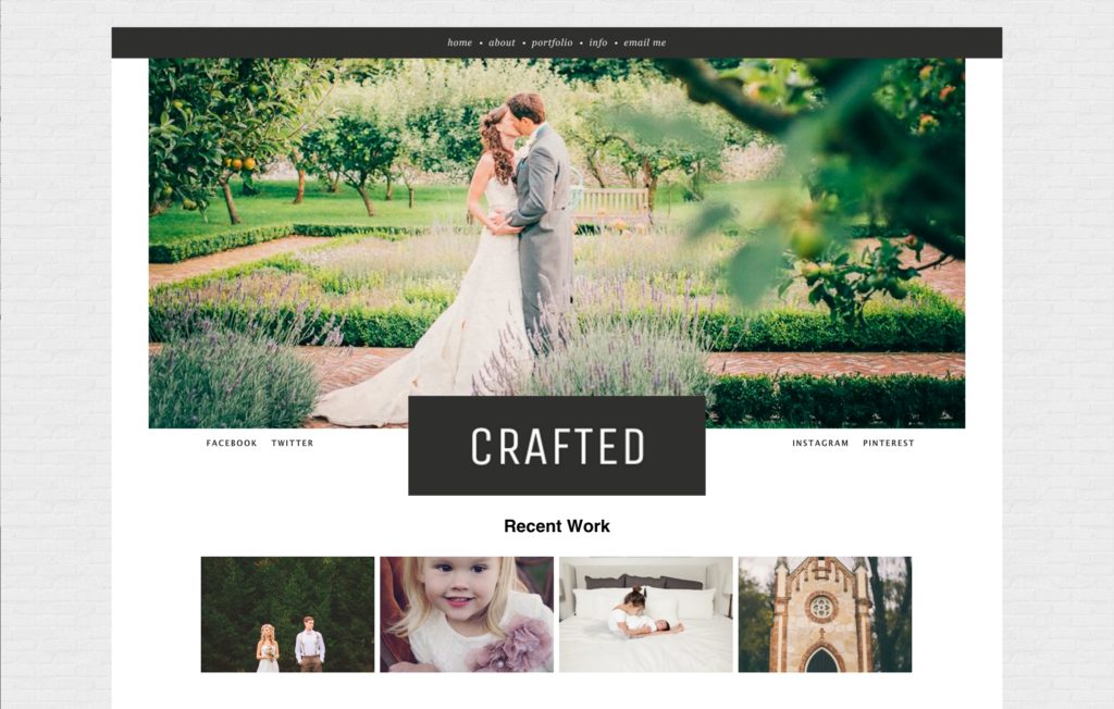
On a normal desktop browser window…
But on a tablet or mobile device, with a smaller window size, as those grid items get smaller, it could make them hard to view or tap. So using breakpoints, the site may rearrange those grid items to 2 rows on a tablet.
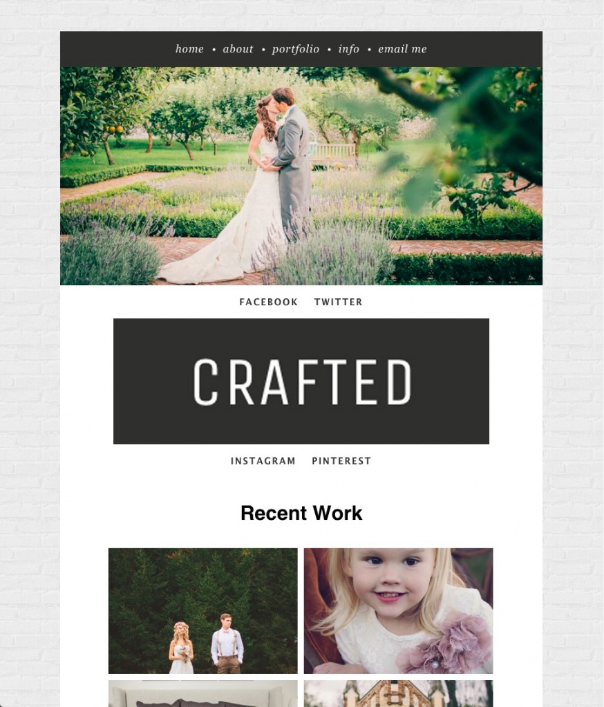
On a tablet screen…
And then on a mobile device, they may rearrange again to 4 separate rows.

And on a mobile phone screen.
Again, not only are the images resizing to the screen size, but the entire site is “responding” to the window so that the visitor has the best viewing experience. The grid images stay large enough for the viewer to see them fully and easily interact with them. And as you can see from the screenshots above, not only is the grid rearranging itself, but the logo placement is being modified, the menu is changing and so forth. The site is dynamic and flexible, not fixed and rigid.
You may have to shift your mindset when designing and building a responsive site with ProPhoto.
Important Considerations
When designing a responsive site, as just discussed, be aware that your site is going to look different on varying windows and devices. So as you design your site, feel free to periodically change your browser window size. Make it huge, make it small; see what happens when you do so. Pull up your site on a tablet or phone and see how it responds. The point is, don’t design your site thinking it’s going to always look exactly how you see it at one size.
For this reason you won’t want to focus on “pixel precision.” Because your site has to be fluid, keep in mind that spacing, sizing, and placement on the site will have to adjust. So if you try chasing the exact pixel spacing between your logo, menu and masthead, for example, be aware that it can’t happen since these items have to be flexible.
As such, you should know that there may be some things you want to do with your site that just aren’t possible in a responsive environment. But these limitations are far outweighed by the benefits a responsive site will provide.
Going Further
You have a lot of control in ProPhoto 6! Here are several tutorials which show you how to work with your layout to take control over how your design changes and fits different screen sizes:


