Select a font style and alignment for grid titles and text.
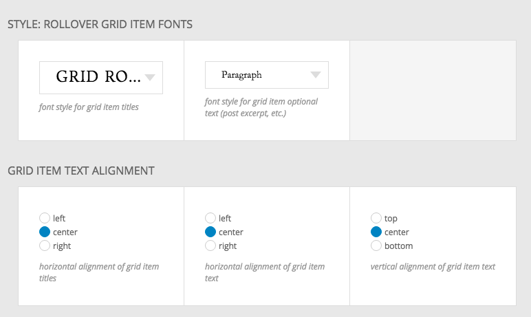
These settings for example would result in the following:
If you would like to give some contrast to your grid, against the background of the area where it is being displayed, you can make use of a grid background color or image.
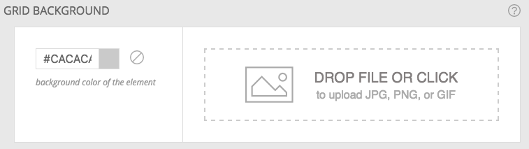
This is independent of any other background settings that you may have made for the template, block, row or column. Instead, it is only applied to the grid itself.

Apply an image border and rounded corners to the grid images.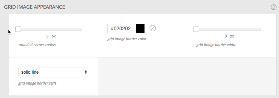
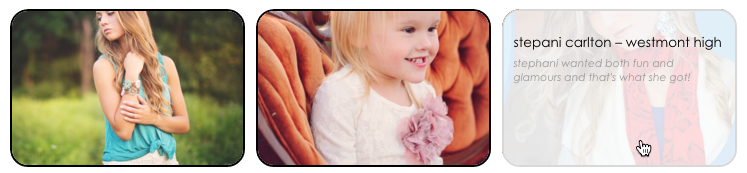
Here you see both an image border and rounded corners
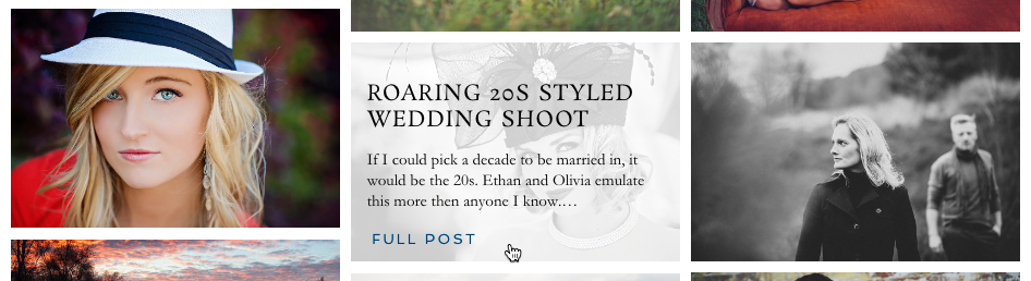
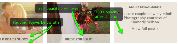
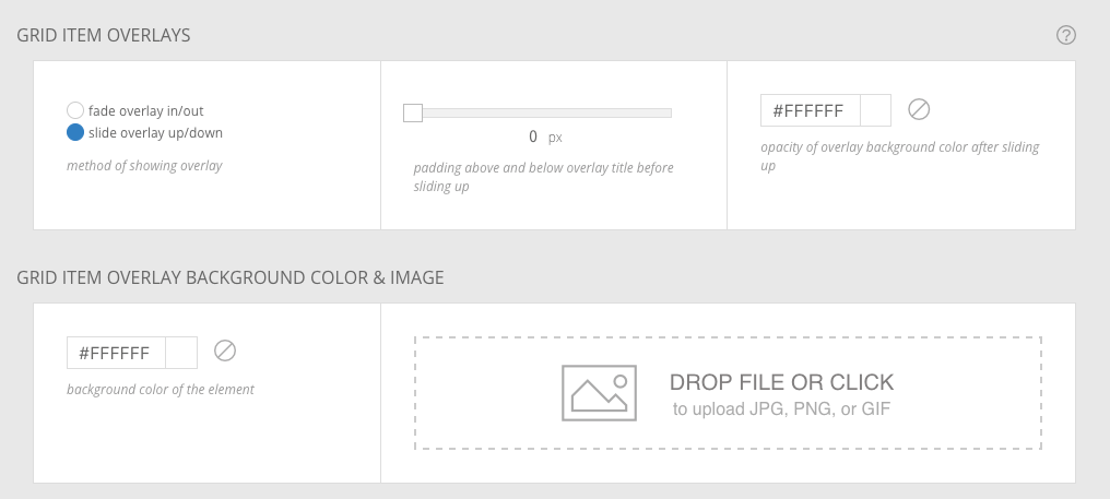 Change the color and opacity of the overlay which covers the thumbnail when the cursor is hovered over each thumbnail. The overlay can fade in
or slide in.
It’s a good idea to use a color which contrasts the text that will appear on top of this color overlay. Greater opacity means the color is less transparent (more “opaque”). So 0% opacity means it would be totally transparent, you wouldn’t see the overlay at all and 100% opacity means the overlay would have no transparency. When the slide option is selected you get to choose the opacity of the overlay for the non-hovered and hovered states.
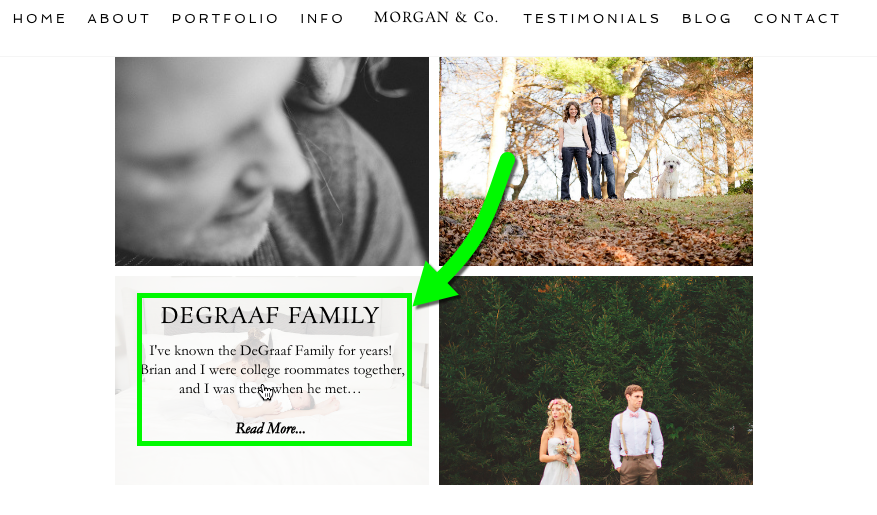
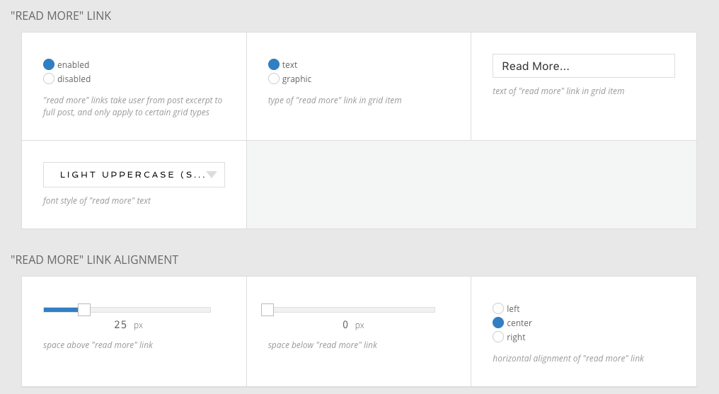
Be default, many designs have a “read more” link in the text portion of each grid item. This link opens the full post/page/gallery, and makes it obvious that visitors must tap or click to view the full content.
The link itself can be text, an image, or a tile. This screenshot shows the options when you use the text appearance:
And here is an example of an image or tile being used for a different appearance:
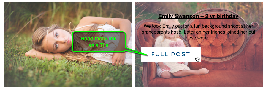
To remove the ‘read more’ link, toggle the first option to disabled.
A slide overlay with labeled areas

A fade overlay with with labeled areas
To control what is shown as a grid thumbnail for posts containing no images (or that don’t have a featured image set), you can use the Grid Fallback Image option provided.
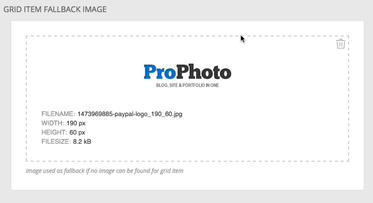
Whatever image you upload here will be shown as the grid thumbnail for any such post or page, when it’s displayed in a grid.