When using a background image, you may control its position. Several options are available for position, each placed in the respective spot in this table:
| top left |
top center |
top right |
| center left |
center center |
center right |
| bottom left |
bottom center |
bottom right |
The image will be placed, relative to the edges of the layout item, in the location you select. For example, bottom center will align the bottom edge of the image to the bottom edge of the item, and will align the horizontal center of the image with the horizontal center of the item, like this illustration:
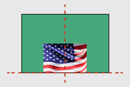
background image positioned bottom center of green element
Like other settings, this image position can be applied at a parent level and inherited.
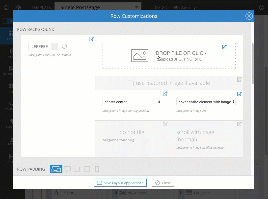
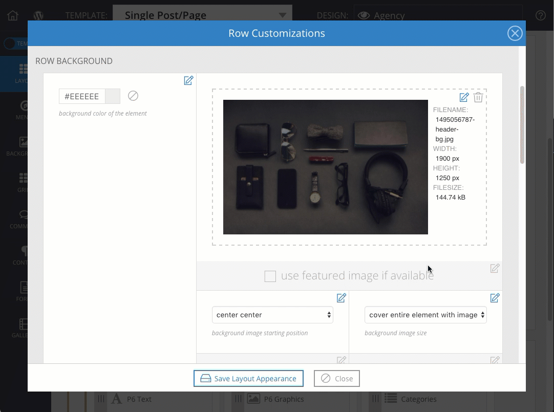
Background images have a width & height shown in the file details after upload, but you can use the size control to affect how the image is applied to the element. A few options are available for size, each defined below:
- actual size: no scaling, with cropping.
This will fix the image at 100% size in the background area without scaling. Background area will remain uncovered if the image is not large enough, and the image will be cropped away where it is larger than the element.
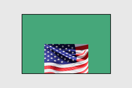
- contain image within element: with scaling, no cropping.
This will fit the image in the background area by scaling to the edge of the space. Background area will remain uncovered if the aspect ratio of the image is different from the aspect ratio element.
- cover entire element with image: with scaling & cropping.
This will fill the image in the background area by scaling to the edge of the space. Background area is covered completely, but the image will be cropped away where it is larger than the element.
Use different window or screen sizes to check how each background size setting affects your image. And if images look too grainy or pixelated when they are scaled, try uploading a larger resolution of the image for your background.
Background images have a width & height shown in the file details after upload, but you can use the tile control to affect how the image is repeated behind the element when the image is too small at actual size. The options are each defined below, followed by an example:
- do not tile: if the image is too small for the element background area, it will not be repeated. (see section above for cover and contain options)
do not tile example
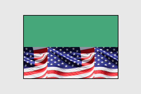
- tile: if the image is too small, it will be repeated horizontally and vertically as needed to fill the element background area.
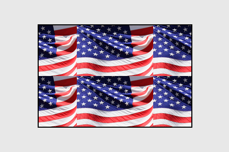
tile example
- tile only vertically: if the image is too small, it will be repeated vertically only as needed to fill the element background area.
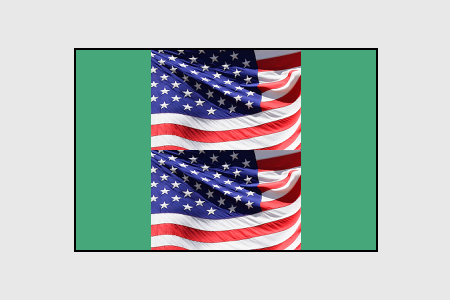
tile only vertically example
- tile only horizontally: if the image is too small, it will be repeated horizontally only as needed to fill the element background area.
tile only horizontally example
Tiling is typically not used in combination with the cover size option explained in the image size section above, but may be used when actual or contain sizing is selected.
Background images are usually set to scroll with page, but you can also choose to have backgrounds stay fixed in place.
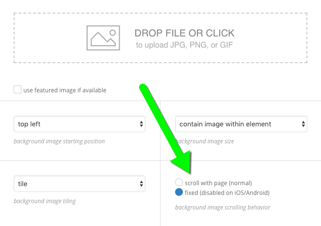
When a background is set to stay fixed in place, it appears stationary in the browser, even while scrolling. The image position (see the section above) will be relative to the browser window, and not the element. This means that bottom center is the bottom center of the browser window, regardless of where the item is on the page. For example:
Typically, stay fixed in place is applied to the site layout item background image, since it is the main background of the site. But this option may be applied to other layout item backgrounds for a cool layered effect.
NOTE: fixed background images will not work on iOS or Android – mobile browsers disable fixed scrolling behavior for performance and battery saving reasons, so images will scroll with your page normally in mobile browsers
The ability to add a background for every block, row and column on your site presents a world of design possibilities. Below are some some examples of common methods used to produce some fun modern background effects.
Backgrounds that fully cover automatically
Any block, row or column can have a background image set to a background size of “cover entire element with image.”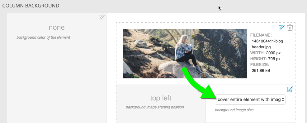
This handy tool causes the image to always cover the full size of the layout item as it shrinks and expands in a responsive environment. The free design called Square uses this feature to great effect. Many of it’s pages share some sidebar widgets in a left column and then a header image to the right that is different for each template. Here is what the layout looks like. 
The right column does not have any widgets, only a background image. The height of the widgets in the left column sets the height of column on the right. As the browser changes size, more or less of the background image is revealed. This image is set to an alignment of top and left. The woman is central in the image so a better choice might have been to set the horizontal alignment to center.
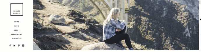
The right side starts getting cropped at a certain point because of the left alignment.
Aspect ratio
There is cropping involved when a background covers an area so carefully consider the aspect ratio you use and the composition of your image. In the example above the column is wider then it is tall so a landscape oriented image with a central focus works best.
Full window backgrounds
These are becoming more and more popular – sites that feature a background image that completely covers the initial browser window. The home page of the Homer design in our store is a good example.
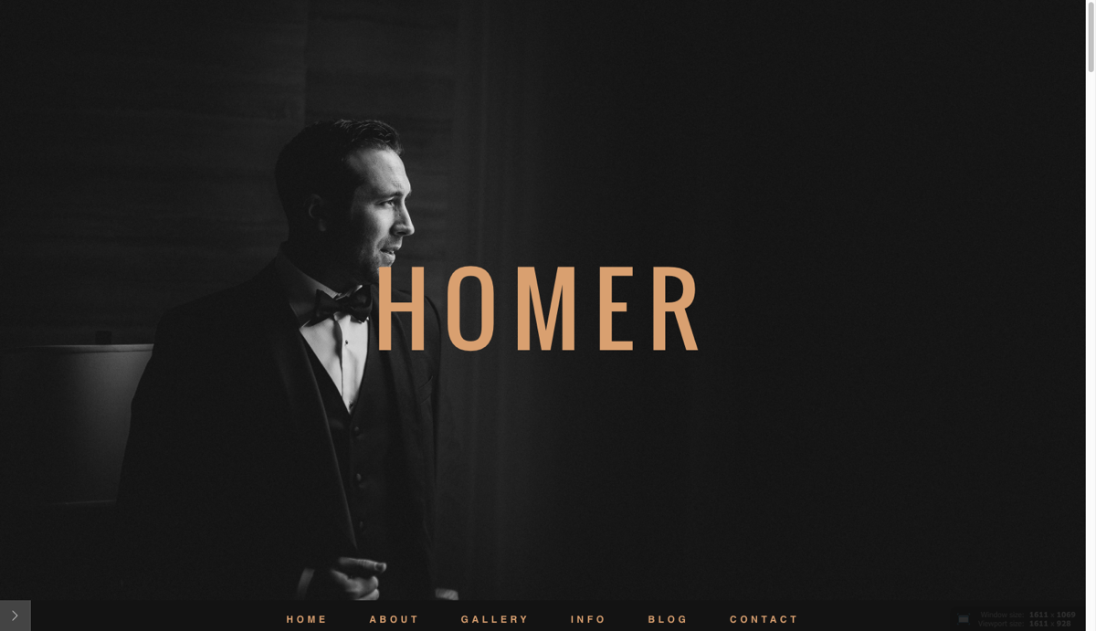
The background image fully covers the browser window on initial load
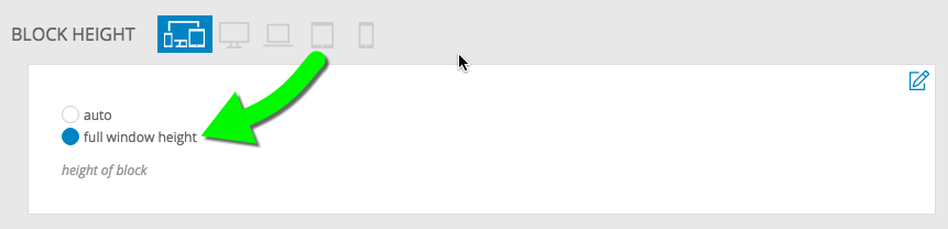
This time a block background is used for the top block in the template for the landing page. The block with this background image should be at the top of the layout if that is the first thing you want visitors to see. Besides setting the background size to cover, the key to making this work is setting the block to occupy the full window height in “ProPhoto > Customizer > Layout > Block > Block Appearance > Block height.”
Any widgets you add to the block will appear on top of this background image. Use top padding on the row or column as well as the vertical widget alignment options to dial in the position of the widgets on top of the background.
A scroll-to link is a good idea if you don’t have a menu immediately visible. You can set a tile, image or menu link to scroll to a block or row lower in the same page.
Parallax background images
Selectively applying fixed background images to some blocks and a solid color to others achieves a parallax effect as you scroll down a page with multiple blocks. Check out our free Morgan design, to see an example. If you are interested in applying this look to a page on your site try these steps.
- Create a child template and assign it to the page where you want the parallax effect.
- Make sure you have multiple block sections in your site layout in “ProPhoto > Customizer > Layout”. Each block can be filled with any widget content you might want. This is going to create the horizontal ‘stripe’ areas where you see either a solid color or a static background photo. The height of the widgets and the top/bottom padding will set the height of each block.
- Edit the blocks for which you want to show a parallax background image scrolling by underneath. Set the background color to be transparent. Any rows and columns inside that block should have a transparent background, as well.
- Upload a large photo (2-3k pixels wide but still compressed) to act as the background image and set up these options for the background image:
starting position – top center or center center recommended
image size – cover entire element with image
tiling – do not tile
scrolling behavior – fixed
- For other blocks, set a solid color as the background. You’ll want to alternate between blocks with color and blocks with the fixed image background.
Repeat steps 3, 4 and 5 for various blocks, and you’ll notice that as you scroll down your site the background image can be seen through the blocks that have the fixed background image, and that it changes as the new block background image scrolls by.
If you don’t see the image, but a solid color instead, double-check that the row and column items in the blocks aren’t adding their own background colors to overlay the block’s background. You might want to experiment with the top or bottom padding (or both) for blocks which act as parallax background ‘see through’ stripes, so you can impact how tall each stripe of background area appears to be.
Notice how the fixed background images show underneath and the blocks with solid color backgrounds seem to slide over top of them.