Different parts of your layout can be setup with restricted width for special effect. The primary way to adjust the width of site layout items is by using padding control. For example, adding 2% left/right padding to a block will reduce the width of all rows appearing inside to 96% the site width. Or, adding 2% left/right padding to a row will reduce the width that it’s column(s) can use to 96% of the row’s width.
To edit padding, click to modify the settings of any item in your layout, like this:
By working with padding, you can inset the edges of the items within. In the example video above, adjusting the right & left padding of the main block will reduce the width of the row found within.
Max width
Aside from padding control, you also have max width control for rows. Edit any row in “ProPhoto > Customizer > Layout” and scroll to the bottom to find the row max width setting.
The width of rows is usually automatic, resizing as wide as possible to fill it’s parent block item. However, using the max width control, you can set a limit for a row’s width.
By limiting the max width of a row, it will adjust to fill the block until it reaches the limit, and then will stop getting wider. This can be helpful when you want to, for example, limit the width of your page/post content area so it doesn’t become too wide on large screens. you can set a row max width for a single row (by editing the row), all rows in a block (Block > Row Appearance), or all rows in a template (Template > Row Appearance).
Different parts of your layout can be setup with different heights for special effect. See an example of height controls, here:
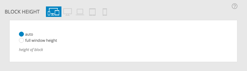
Auto height
The height of each block in your layout is usually automatic, with each part resizing as tall as necessary to fit the height of everything inside. This means, for example, that a block item set to auto height will be the sum of all the row items inside.
Full window height
When you select full window height for an item in your layout, that item will be at least the height of the web browser window (or, screen height on mobile devices). This is a great way to create a full-window section of your layout, like the top of your layout used on your front page.
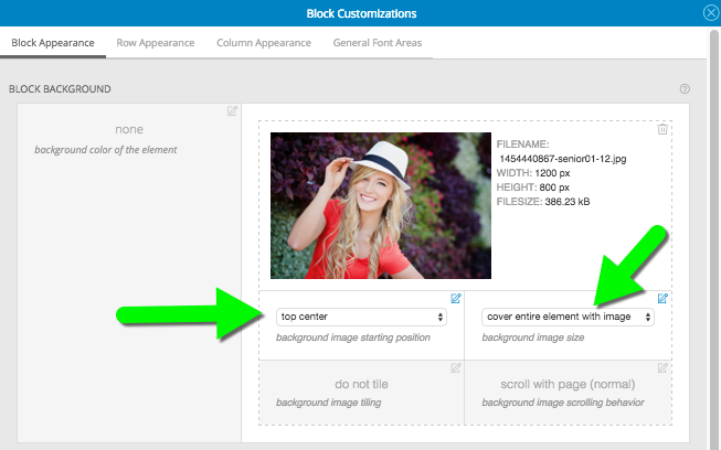
In our example, we’ll edit a block item used at the top of our layout for the menu. First, we’ll adjust the appearance of the block to include a background image with top center starting position, and the cover image size.
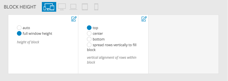
Just a little bit down that popup, we’ll choose to have the block appear at full window height.
After clicking save layout appearance at the bottom of the block’s appearance popup, the background image is applied to the block behind our menu widget. Resizing the browser allows the image to cover the space, filling it up at all sizes – seen here:
The full window height setting is responsive, and will change the height of the area to match the height of the browser, so consider how the height might vary for users – like when they rotate a mobile phone between portrait and landscape orientation.
When setting a block to full window height, ProPhoto also provides a vertical alignment option for rows that are contained inside of that block. That way, for example, you can control where text widgets inside of a full window height block are displayed on the screen.


