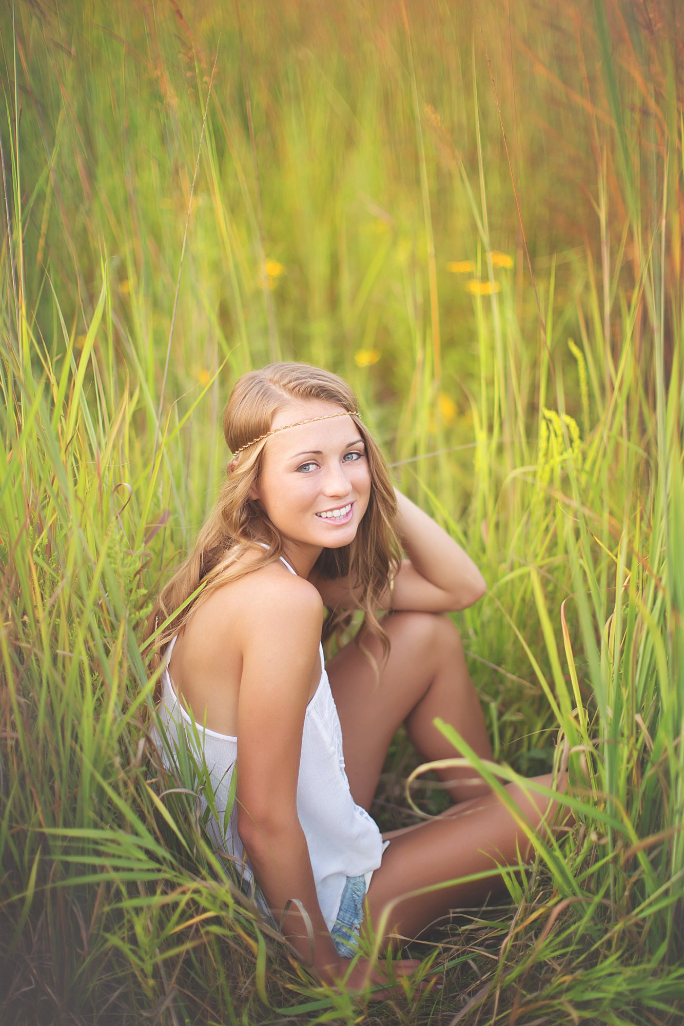
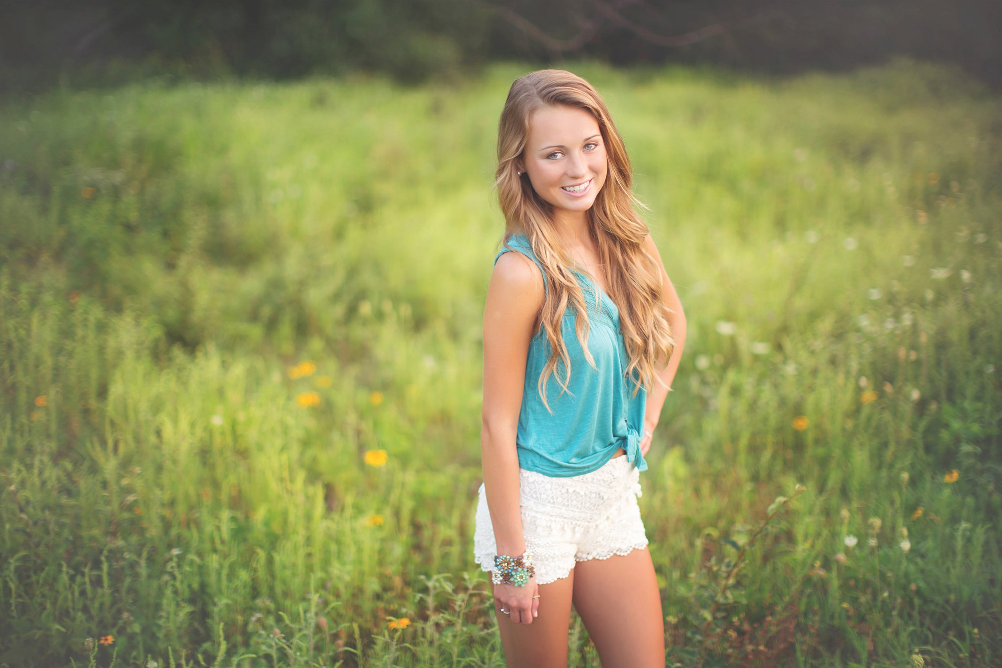
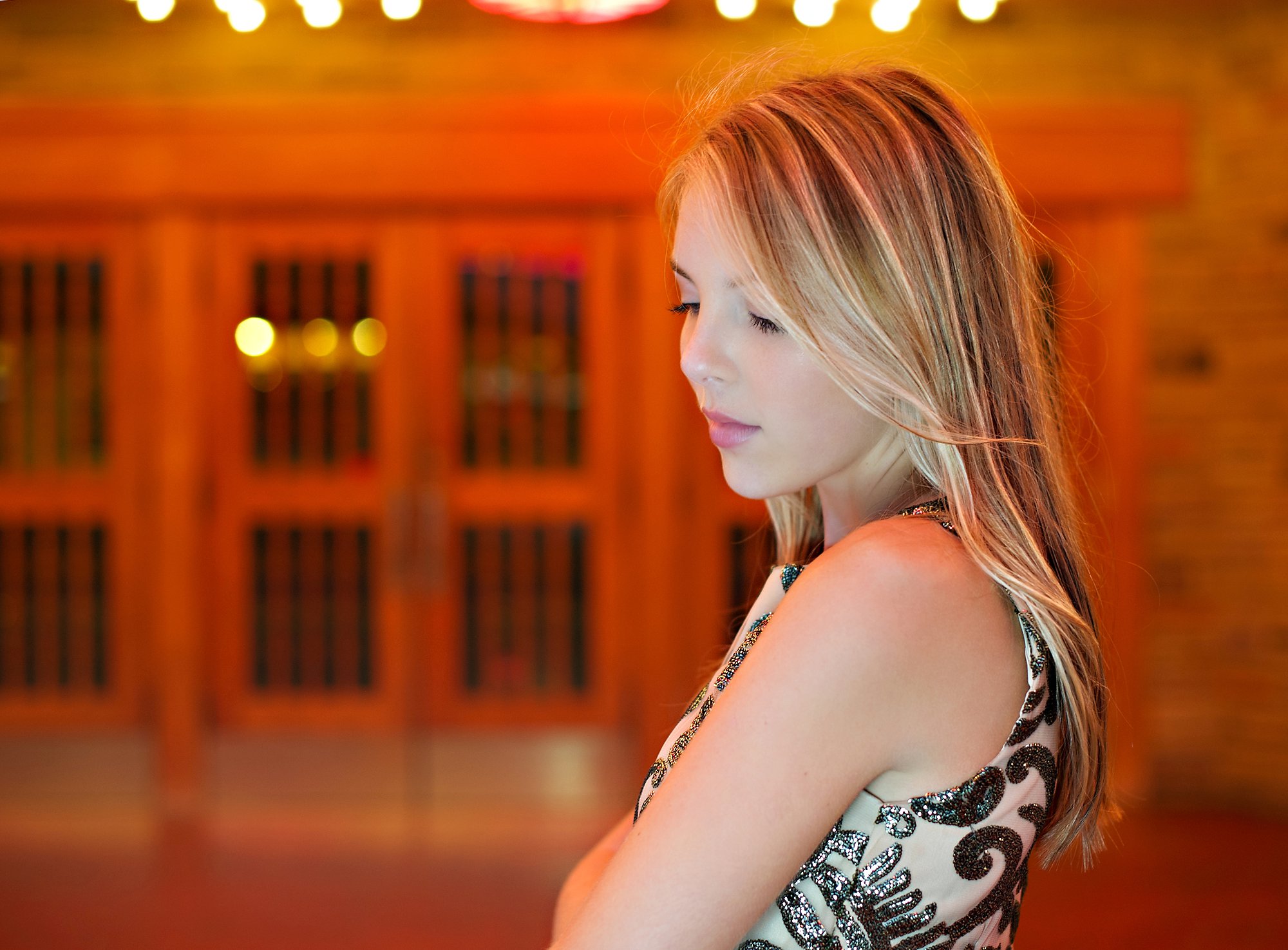
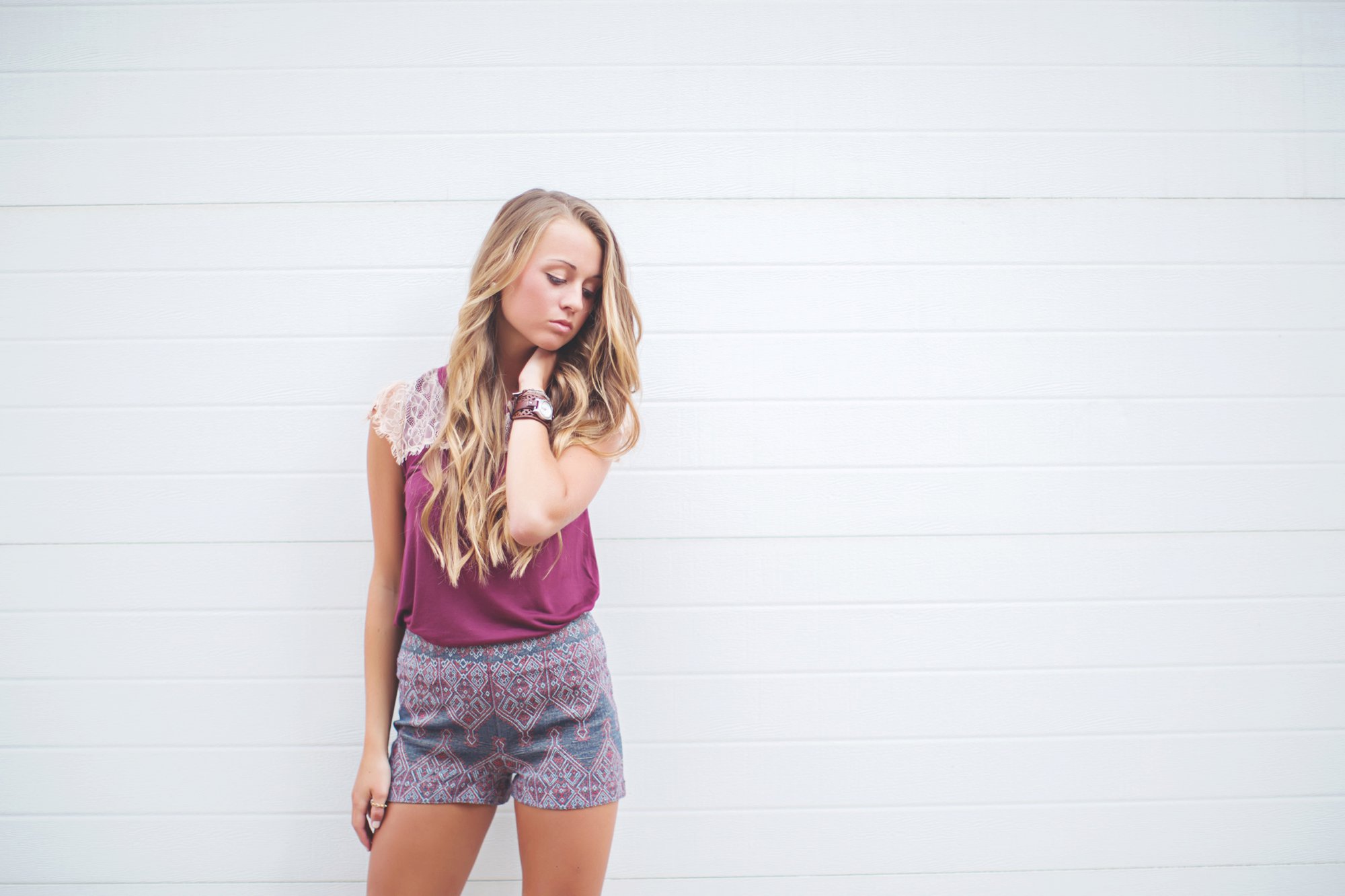
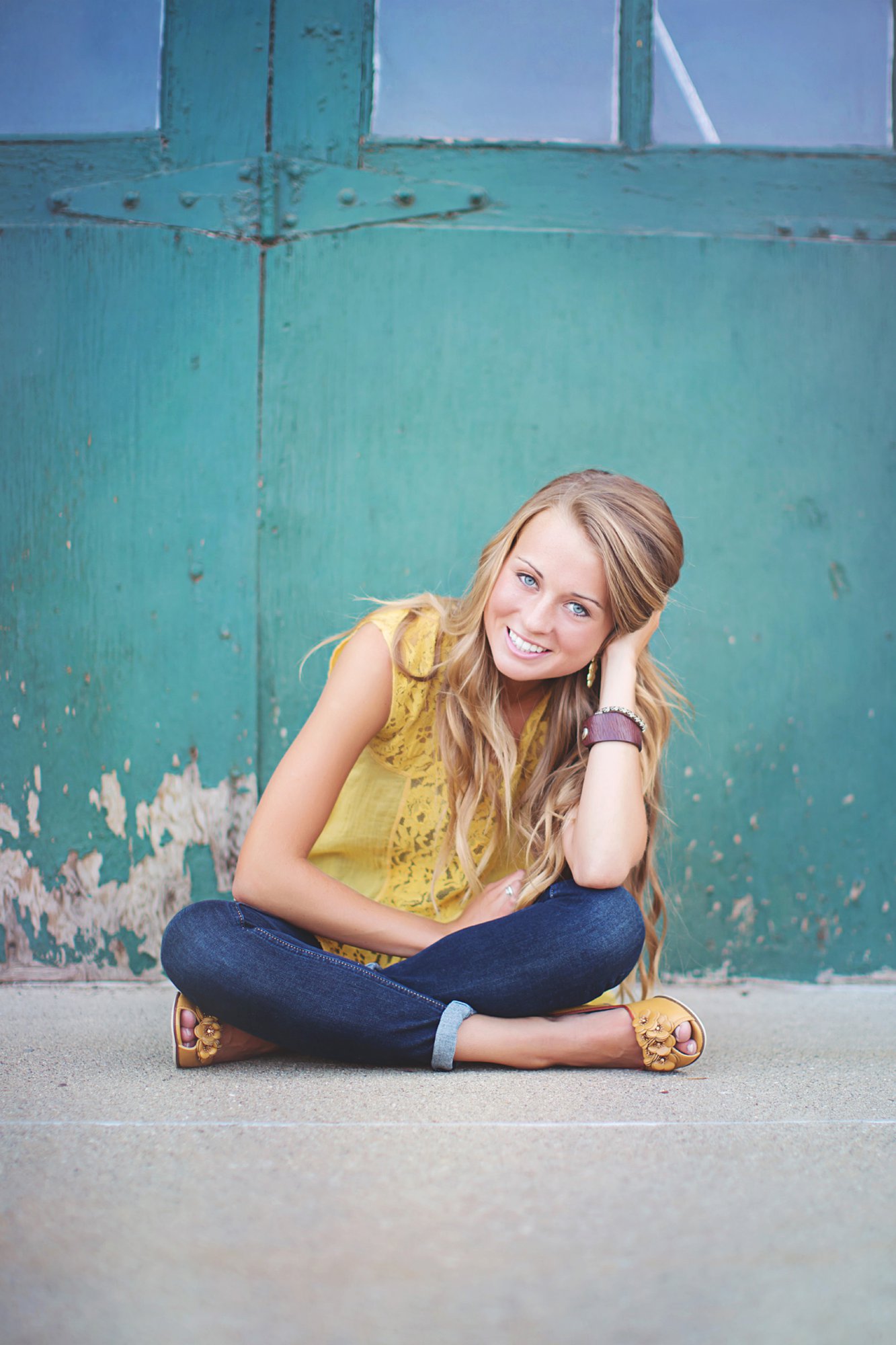
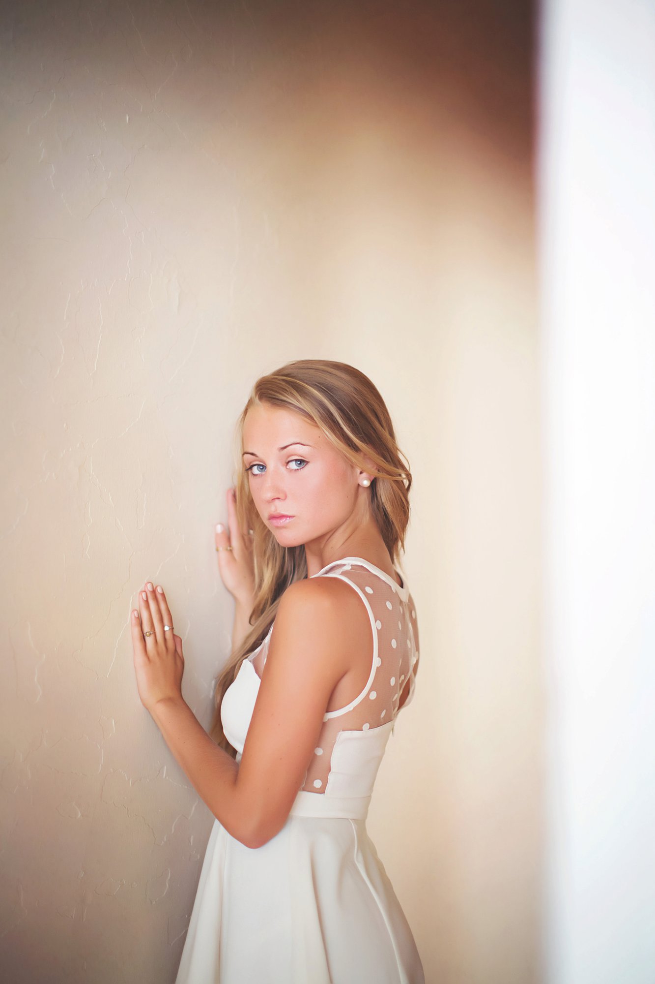
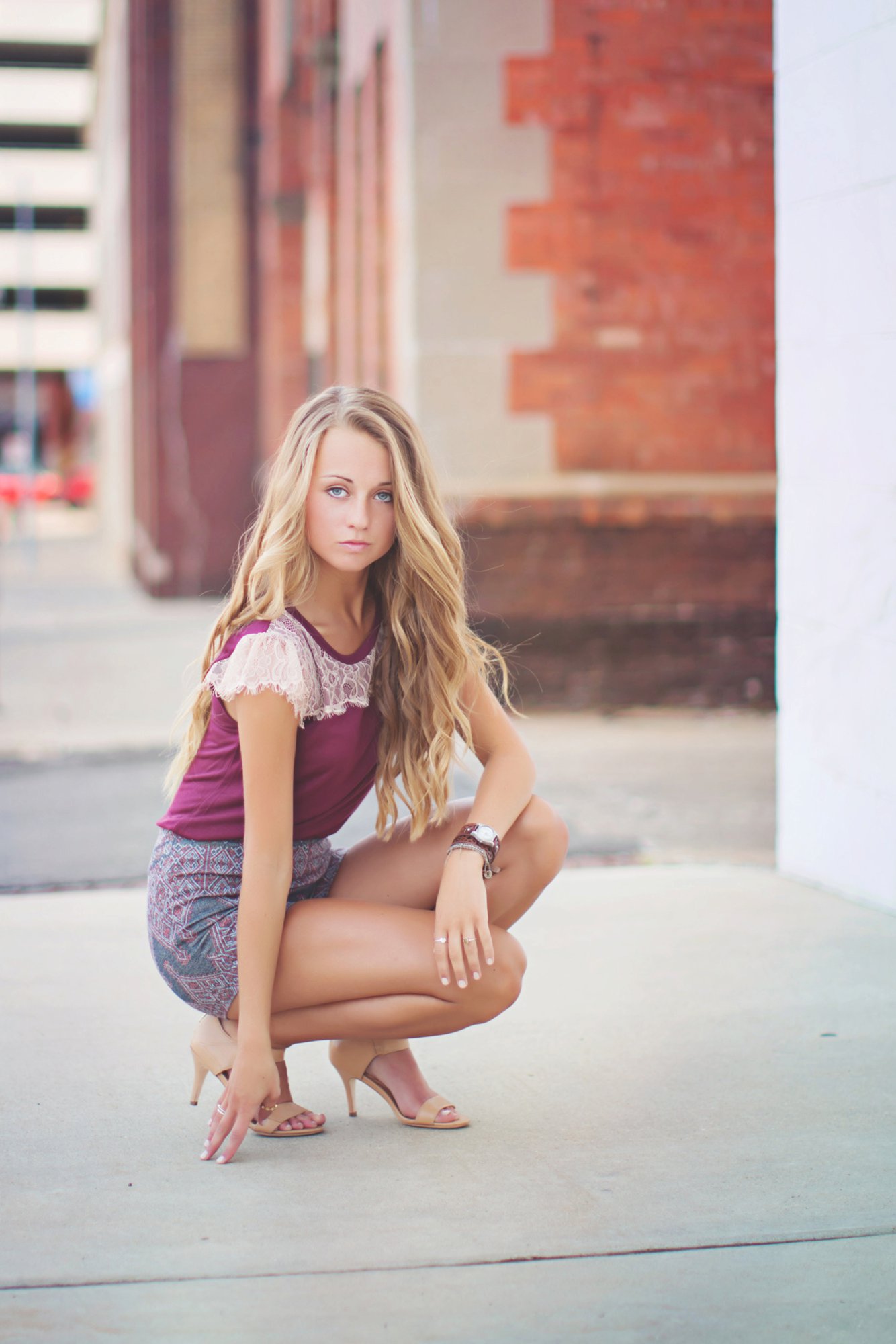
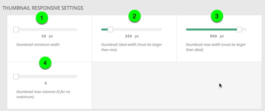
This thumbnail gallery is masonry style, with prev/next links, full window expanded mode, and thumbnail navigation that fades in on hover. Slide numbers are enabled in expanded mode. The thumbnail grid sizing is set to a min width of 50px, an ideal width of 200px and a max width of 900px with no limit to the number of columns. Change the browser window size to see how it changes as the width changes. Click below for instructions and screenshots on how to create the basic features of this style.
Detailed steps for creating this gallery style
General Settings
For each variation of thumbnail grid galleries you will create a new gallery style in “ProPhoto > Customizer > (toggle top-left switch to “Design”) > Galleries and give it a corresponding name. You want to to recognize the style by its name. The thumbnail specific settings are all in “Galleries > General Settings“. First select “thumbnail grid” as the style. The crossfade transition style and the transition speed apply only if the option (described below) to enable an expanded gallery on click is selected. Crossfade gives it a slideshow effect.
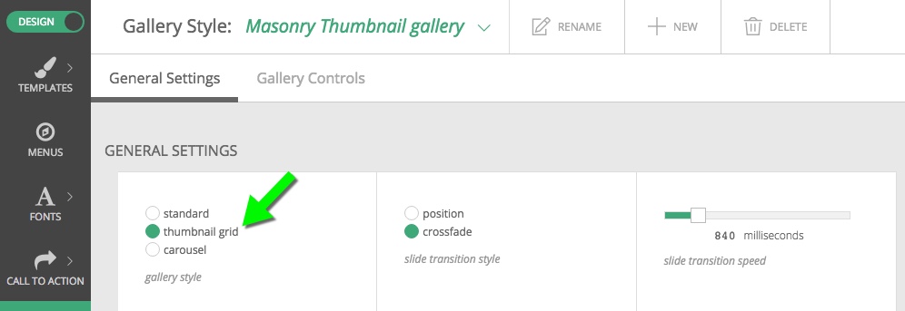 Upon choosing the thumbnail grid style, you will see some other thumbnail specific settings open up below. In the Thumbnail Grid Appearance section choose
- a space (gutter) between each thumbnail
- to show the expanded gallery when thumbs are clicked
- the masonry layout

The Thumbnail Responsive Settings area controls the size of the thumbnail images at different browser window or device sizes.
- A minimum width of 50px allows the images to get really small.
- An ideal width of 200px means that ProPhoto will try to get close to this as much as possible
- The max width is pretty self explanatory. The thumbs won’t get any larger than 900px, even if your site is displayed on a gigantic screen.
- Set the max columns to zero so there is no restriction on that
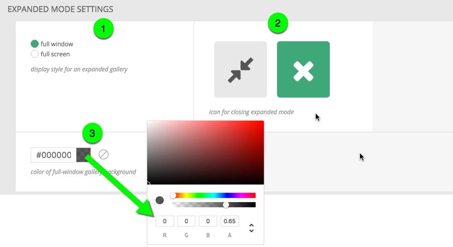
In the Expanded Mode Settings box
- Choose to have the single images fill the window instead of the full screen.
- Select an icon for exiting expanded mode
- Choose the background color that will apply to any areas of your window not filled by the image. This gallery style uses a black background with partial transparency.
The Image Label Settings box is where you turn on the display of slide numbers, which is helpful for proofing purposes. 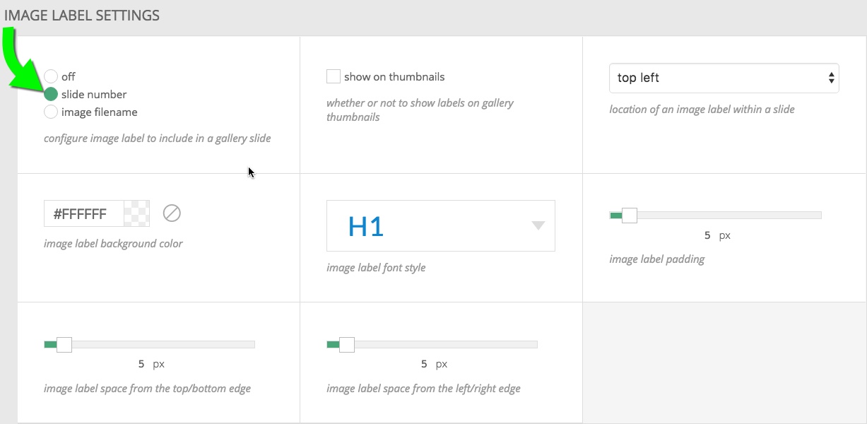
We have unchecked the box to show the number on the thumbnails, to keep that area more clean. As you can see if you click on an image the numbers only show in expanded mode. Use the controls to set the spacing, padding, font style and background color that you desire.
Gallery Controls
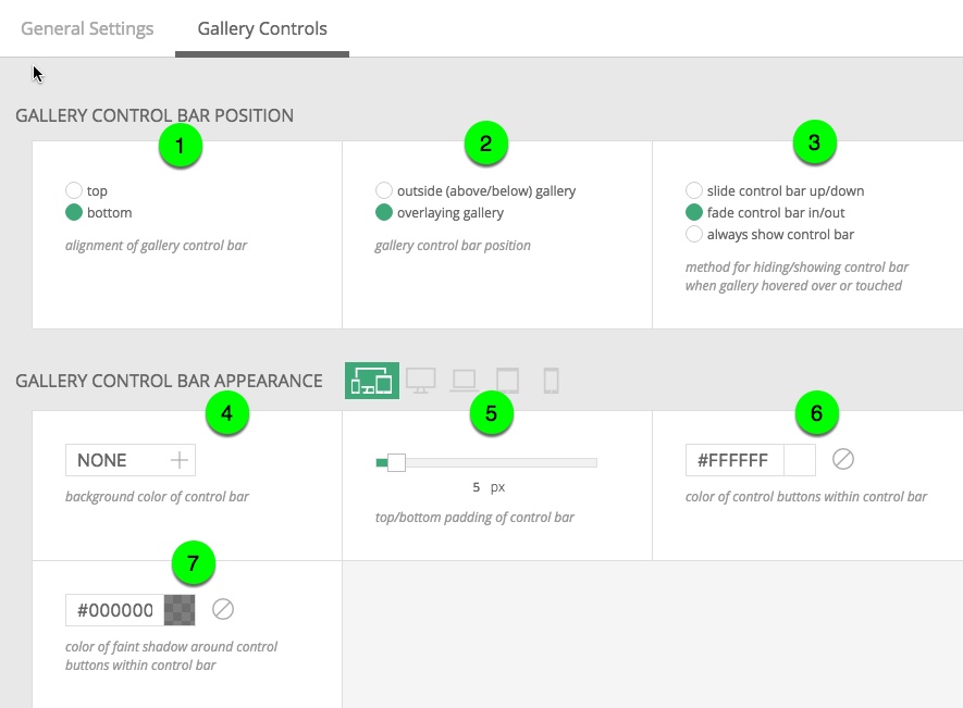
The Gallery Controls area is where you dial in how the controls look and behave. You can mix and match these however you want. These controls will only show up in expanded mode. The view with thumbnails does not have a control bar. What this design does is laid out below.
- The control bar alignment is set to bottom.
- The controls position is set to overlay the gallery. This allows maximum space for the gallery.
- The fade in option for hiding/showing makes the control bar fade in when hovered. Try it in the gallery on this page.
- The control bar gets it’s own background color. Here it is set to none so that the thumbs are right on the main image.
- The top/bottom padding option is set to 5px; but that is hardly noticeable with no background color.
- The control button color is set to be white.
- A partial opacity of 0.5 on a black color gives a nice looking shadow so the buttons stand out.
In the Gallery Controls Sizes area choose how large the controls will be. Note that these sizes can be adjusted for each of the four breakpoint sizes. This allows you to dial in the size of the controls for different screen widths.  There are a couple areas pertaining to the thumbnail navigation appearance.
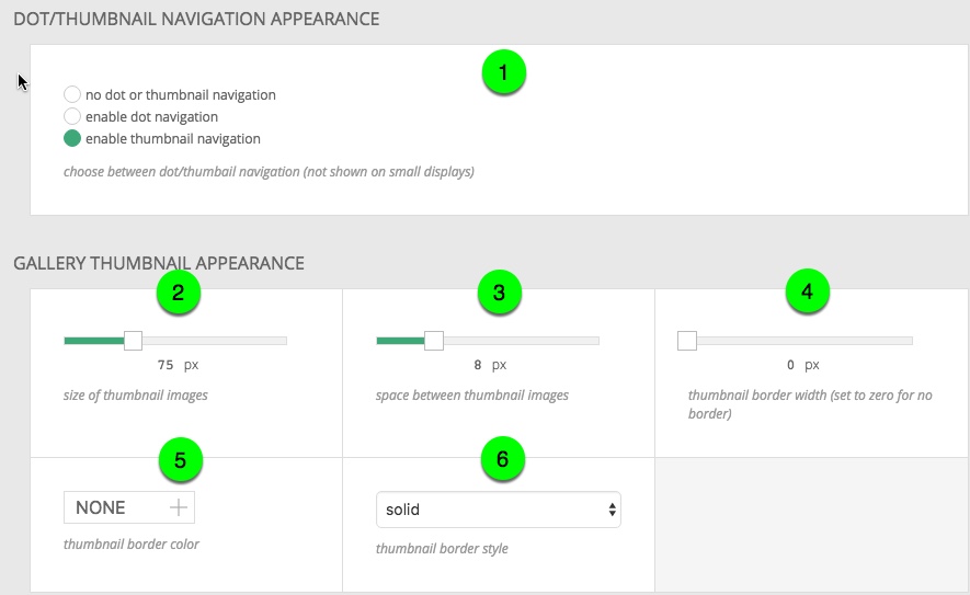
- This gallery has thumbnail navigation enabled. That means there will be thumbnails as a navigation option when in expanded mode.
With thumbnail navigation come some styling options.
- Size = 75px
- Space between thumbnail images = 8px
- Thumbnail border – none here
- Border color – does not apply when no border
- Border style – does not apply when no border
The “prev/next navigation” area allows you to turn on icons for navigating images with a click/touch. When enabled, you get options for color and for the shadow. We use the same settings here as we did for the controls. White and a 0.5 opacity black. 
Below choose the icon type. The icon size is controlled in Gallery Controls Sizes.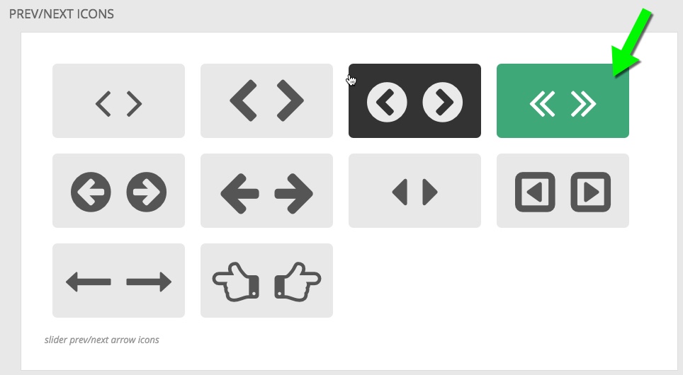
In Slideshow Settings slideshow mode is disabled. This means that navigation in expanded mode will be totally manual and there won’t be a play button.
- 1/26
- 2/26
- 3/26
- 4/26
- 5/26
- 6/26
- 7/26
- 8/26
- 9/26
- 10/26
- 11/26
- 12/26
- 13/26
- 14/26
- 15/26
- 16/26
- 17/26
- 18/26
- 19/26
- 20/26
- 21/26
- 22/26
- 23/26
- 24/26
- 25/26
- 26/26

