Each gallery you create appears with a specific gallery style applied. Work with your gallery style presets in “ProPhoto > Customizer (toggle to design group) > Galleries”
If you want a gallery to appear a certain way, or with certain controls you create a style that includes one of those options. Then you apply the style as a default or to a specific gallery. Check out Example galleries to see links to live examples of a few gallery styles and a detailed description of how to create them.
All free and paid designs come with at least one pre-existing gallery style and most have at least three. Create a gallery style by clicking the New button, or edit an existing style by choosing one from the dropdown. 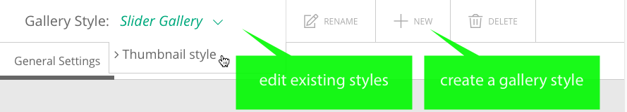 The gallery style you are working on shows in green at the top of the page. Give your styles descriptive names so you can tell them apart later. Expand the topics below to learn more about some specific style options. See Example galleries
for some sample gallery styles and detailed instructions on how to create them.
The gallery style you are working on shows in green at the top of the page. Give your styles descriptive names so you can tell them apart later. Expand the topics below to learn more about some specific style options. See Example galleries
for some sample gallery styles and detailed instructions on how to create them.
Standard style galleries
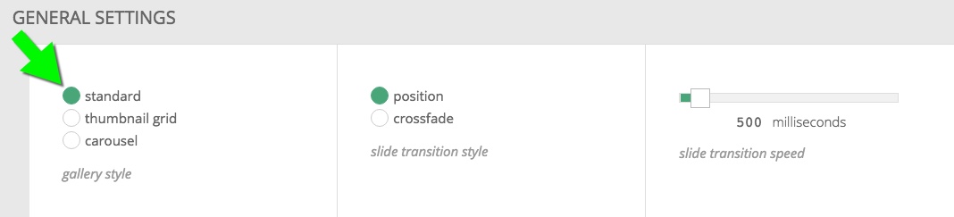 A standard style gallery displays one image at a time in a gallery player that maintains a specific aspect ratio as it grows and shrink to fit the space available. The aspect ratio of the gallery player is determined by the first image in the gallery. So if the first image is landscape, any portrait oriented images in the gallery will center themselves inside the landscape player, revealing the gallery background color on the right and left sides.
This type of gallery is typically called a “slider” or “slideshow.” A slider would use the position transition style and a slideshow would use crossfade. Standard style galleries can be set up with or without controls
Height constraint
Because the gallery player can potentially expand as wide as your monitor (barring width limitations), the images themselves can get quite tall. They can be so tall so as to require vertical scrolling to view the whole image. For this reason there is a gallery height constraint option. 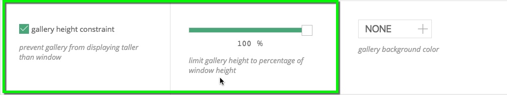
Note: This height constraint does not apply to the image when it is in expanded mode.
Autoplay
In the Gallery Controls tab all the way at the bottom in Slideshow Settings is an option to enable slideshow mode. 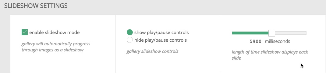
This is how you achieve a gallery style that starts automatically when the page is loaded.
Additional options
Mix and match general and controls settings to achieve the style you desire. For some examples and detailed walkthroughs preview the slider and slideshow type galleries on our Example galleries
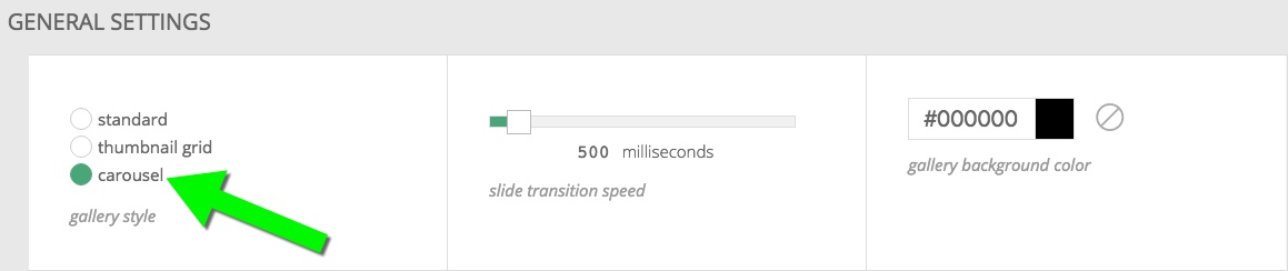
Carousel Style Galleries
A gallery style that includes the carousel option will display the images in a in a fixed height sliding carousel gallery. For a demonstration of this style and a full walkthrough see Carousel galleries
.
Carousel galleries are fixed height (even in expanded mode) by nature but we provide options for adjusting that fixed height at four different widths. Carousel galleries will look best if there is a decreasing height from desktop to mobile. This helps maintain an aspect ratio that allows the previous and next images to be seen.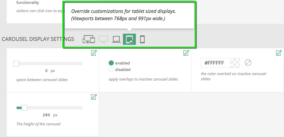
Additional options
Mix and match general and controls settings to achieve the style and functionality you desire.
Thumbnail Grid Style Galleries
A gallery style that includes the thumbnail grid option will display the images in a thumbnail grid. For a demonstration of this style see one of the three thumbnail demonstration galleries.
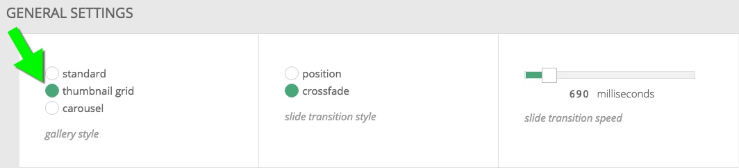
Choose the distance between each thumbnail, and whether or not a click will open an expanded mode. The cropped layout produces thumbnails of equal size; the masonry layout preserves the aspect ratio of each image without cropping. 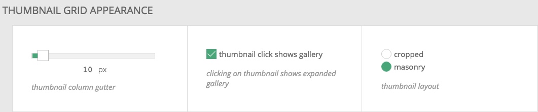 Use the thumbnail responsive settings to dial in how the grid of images size and arrange themselves as the browser window changes size.
 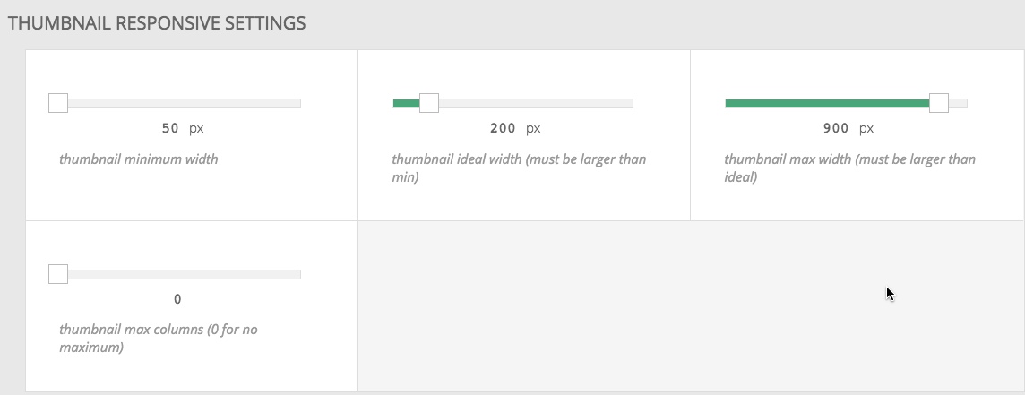 If you want your thumbnail grid to have the same number of columns no matter the browser width set the thumbnail minimum size to 50px, the ideal size to 55px and the max size to something much larger, like 900px. See the Masonry gallery – consistent columns
example gallery for a live demo.
If you want your thumbnail grid to have the same number of columns no matter the browser width set the thumbnail minimum size to 50px, the ideal size to 55px and the max size to something much larger, like 900px. See the Masonry gallery – consistent columns
example gallery for a live demo.
Additional options
Mix and match general and controls settings to achieve the style you desire. For some examples and detailed walk throughs preview the thumbnail type galleries on our Example galleries page.
What is expanded mode?
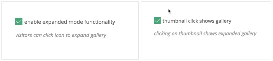 When enabled, the gallery view can be enlarged when a visitor clicks a thumbnail. Or in the case of carousel or standard styles, clicking an icon opens expanded mode as, seen in the image below.
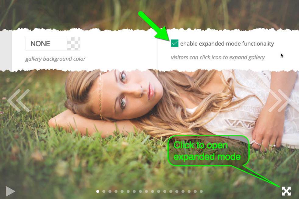 A full window view will fit the image to the browser window. This is more often than not the desired effect. A full screen view will fit the image to fill the entire screen, as allowed by the device. Here is an example of two galleries in full window view:
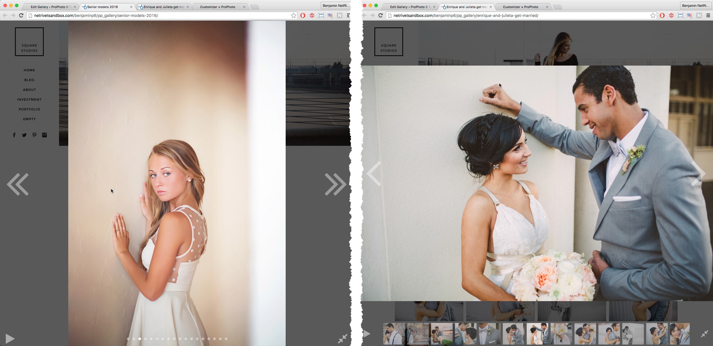 The left half of the example above shows a standard gallery in expanded mode with dot navigation, prev/next buttons, and slideshow mode enabled (note the play/pause button at the bottom left). The right half of the example shows a thumbnail grid in expanded mode with thumbnail navigation below the main image view, prev/next buttons of a different styling, and slideshow mode turned on (note the play/pause button at the bottom left).
Show image ID or filename
In General Settings of every gallery style is the option to add image labels to gallery images. This is helpful for those who are using ProPhoto galleries for proofing purposes.
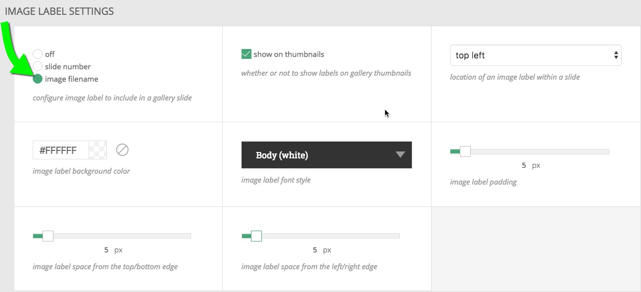 You can choose to show the slide number or the image filename with some positioning and style options. Thumbnail gallery styles have an additional option for turning the labels on or off for the thumbnails. This is nice if your filenames are long or your thumbnails are small. If turned off, the labels only appear in expanded mode. The screenshots below show a couple examples. See our Masonry thumbnail gallery
for a live demo of a thumbnail grid with slide numbers only in expanded mode.
You can choose to show the slide number or the image filename with some positioning and style options. Thumbnail gallery styles have an additional option for turning the labels on or off for the thumbnails. This is nice if your filenames are long or your thumbnails are small. If turned off, the labels only appear in expanded mode. The screenshots below show a couple examples. See our Masonry thumbnail gallery
for a live demo of a thumbnail grid with slide numbers only in expanded mode.
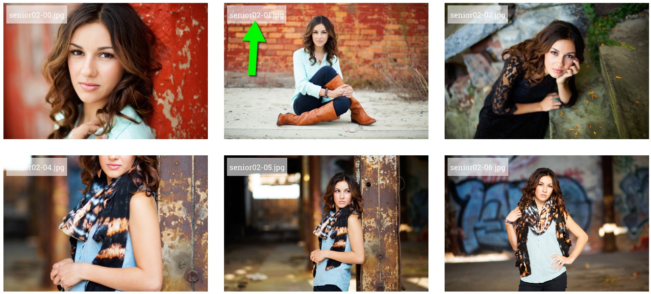
Filename labels on a thumbnail grid
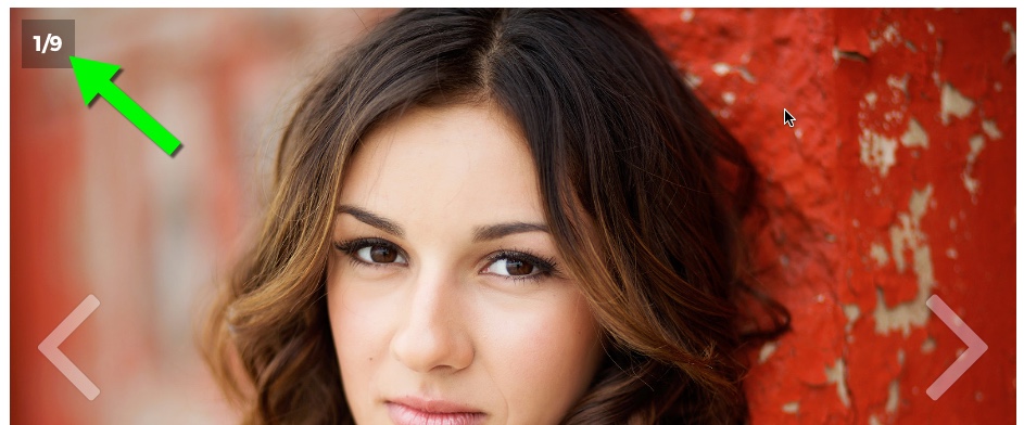
A slide number applied to images in a standard gallery style
Gallery controls
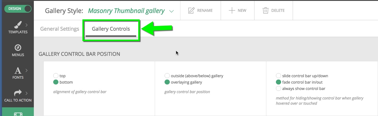 In this tab, you can set the style and position of the gallery controls, such as navigation arrows, play/pause buttons, dot or thumbnail navigation strips, and more. Options include:
- position, visibility, and appearance of control bar
- automatic slideshow mode playback and ‘hold’ duration for each slide
- play/pause button visibility and style
- left/right navigation arrow styling
- dot/thumbnail navigation styling
Use these options to create a slideshow gallery that plays automatically, and turn on/off the different controls your gallery style provides. Additional gallery style presets can be made if you need variation for your galleries. Our Example galleries are set up with a variety of options for you to see a variety of control options in action.
Breakpoint specific changes
Sometimes, there is a need to dial in the color or size of your controls at specific widths. A common desire, for example, is to reduce the size of the previous and next buttons for small devices. Click the device icons to override the general settings at that specific width. 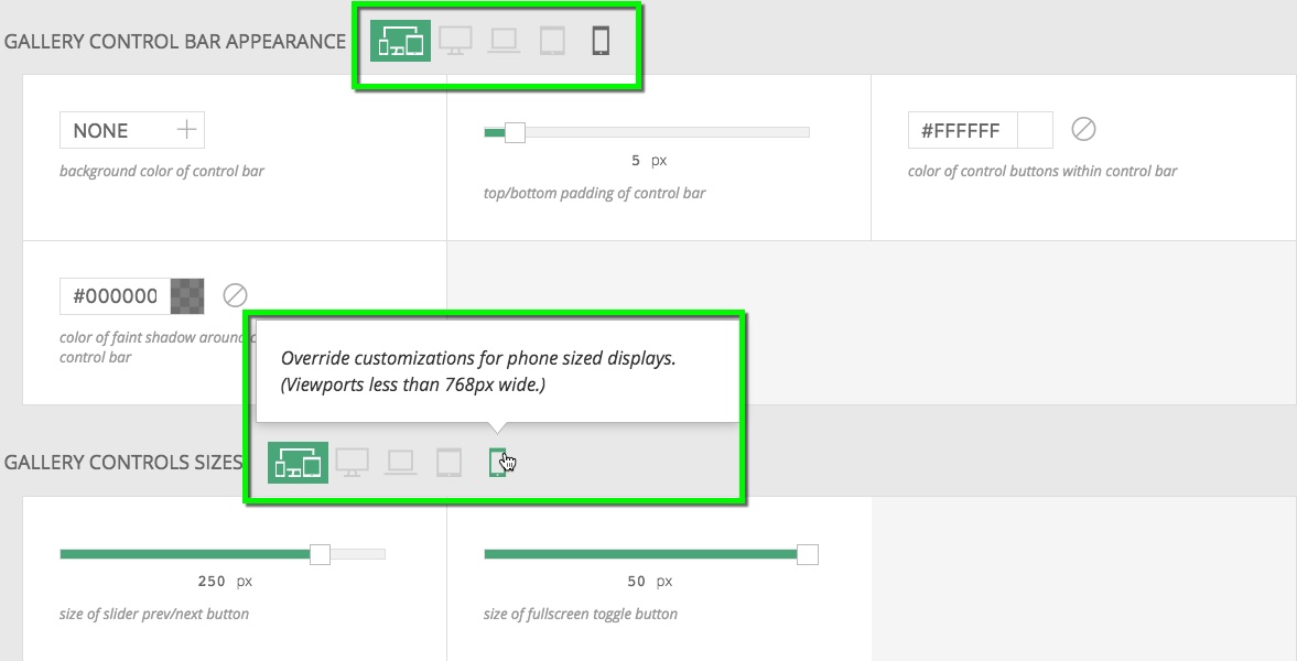
Touch device control changes
In order to accommodate certain device imitations, a couple of changes happen automatically for touch devices.
- Navigation links will always appear at the top of touch devices (less then 992px) This is so as to not interfere with built device navigation options at the bottom of the screen on certain devices
- At the “phone” width (less than 768px), the navigation links will disappear entirely.
Apply a gallery style
After you have created a gallery style, it will be available for use with any gallery.
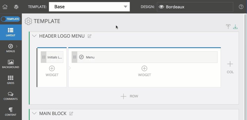
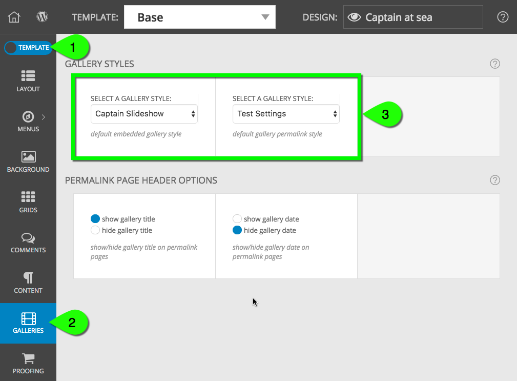
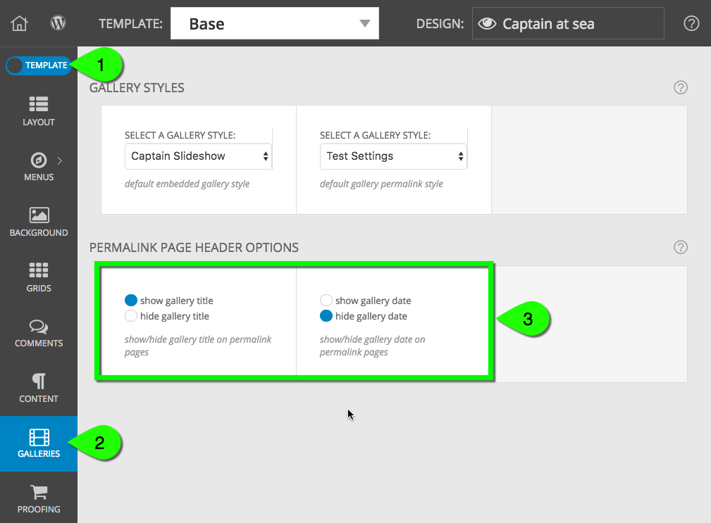
In “ProPhoto > Customizer (toggle to Template group)> Galleries” choose which of your styles should be used for every gallery by default. (we recommend doing this in your Base template)
This saves you the effort of choosing a style for every gallery, and makes it easy to switch your preference in one place in the future. You can set the style default for:
- embedded gallery – galleries you insert into a blog post or web page in WordPress, or galleries you insert into your templates using a P6 gallery widget
- gallery permalink – the directly-linked page for any gallery
(link directly to galleries by using a gallery menu item or by using a galleries grid). See an example here.
This is a template-specific setting that is normally made in the base template to apply everywhere. But you may override your choice for individual child templates. If changes made in this area don’t update some of your galleries, they might have a different, specific gallery style applied directly to them – see the options below, which may affect some of your galleries:
Apply a style when creating a gallery
You can override the default gallery style described above when creating or editing individual galleries. Simply choose a style with the dropdown.
Any time the gallery page is accessed directly, this style will override the defaults.
Apply a style when embedding or linking to a gallery
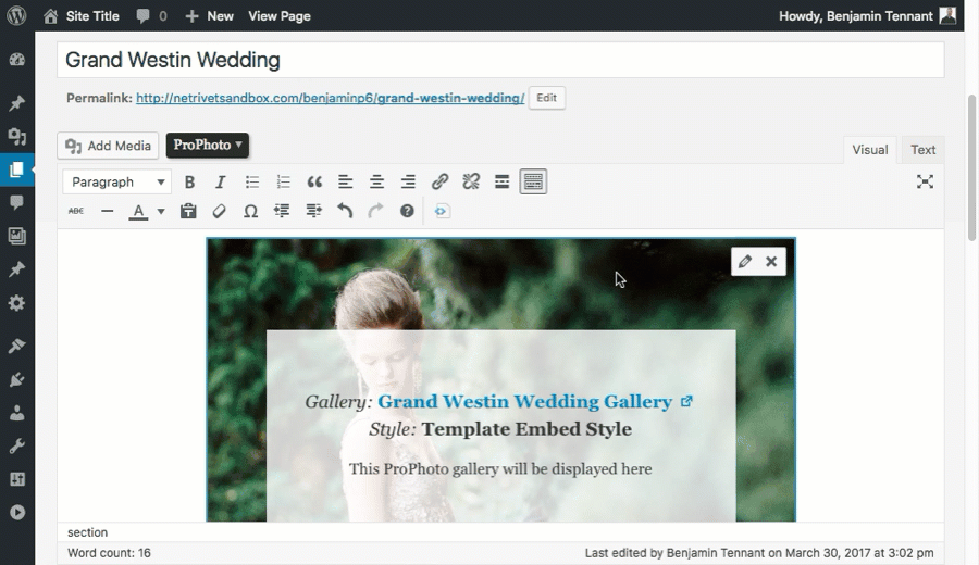
You can override these default settings when you embed a gallery. For example, when inserting a gallery into a post or page:
Or select a gallery style when inserting a gallery widget, seen in this video:
Gallery page dates and titles
A ProPhoto gallery is a custom post type. As such it can have a title and date, just like a blog post. When viewing a gallery at it’s unique permalink, by default the gallery title will appear, but the date will be hidden. These settings can be changed, though in “ProPhoto > Customizer (design group) > Galleries”.
The gallery title and date style is effected by the same settings that control post/page heading style in “ProPhoto > Customizer > Content > Post Header”.
How can I display my gallery images as full size?
Any gallery in a post or page can be displayed as full size images instead. The benefit of this are twofold
- You don’t have to hunt through your media library to find these particular images to insert directly.
- Any edits you make to the gallery (add, delete, reorder) will be reflected in these full size images.
This is not really a gallery style, so much as a different way to insert your images. When inserting a gallery into a post or page you’ll be presented with a radio button to check to make them full size, as if you had inserted them directly into the post/page. 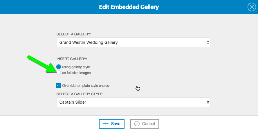 For galleries that have already been inserted, edit the gallery to find that full size option again.