
ProPhoto is a responsive framework, which means that your site will resize and realign itself to fit whatever browser window it’s shown in. If you aren’t already familiar with the View Mode option provided in the ProPhoto Visual Builder, you’ll want to check it out. View Mode allows you to view your site as it will appear on desktop, laptop, tablet and mobile devices.
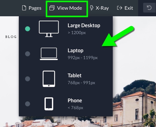
That way, as you work on your site, you can see how it behaves and adjusts itself for various devices.
While ProPhoto is pretty smart when behaving responsively, there may be changes you want to make for how your site displays on a particular device, like mobile. For this reason, ProPhoto provides device specific overrides within the settings for layouts, blocks, rows, columns and modules.
Any appearance setting provided within an element (background, padding, border, etc.) is given an override option for every device type. So for example, if you have a border applied to a column that you like for desktop and laptop, but not on tablet or mobile, you can use the border override within the tablet and mobile settings of the column to disable.
To make such a change, click to edit the element you’re wanting to customize, and there locate the “Settings Overrides” options. Simply click on the device you would like to make a change for, and the overrides will appear. For example, if you wanted to change the padding of a particular block, but only for mobile devices, you would do the following:
(As you can see, once you click on the device type you wish to override for, the site automatically resizes itself to that device width in the Visual Builder.)
In addition, for blocks, rows, columns and modules, the device specific settings also provide a “Visibility” override. As the name suggests, this allows you to show or hide specific elements on certain device types. Let’s say you have a block that you want to be hidden on tablet and mobile devices, you would do that like so:
Using these “Visibility” options, your site can become extremely flexible . You could have a column with a specific background image that is set to show on desktop and laptop, but then have a separate column, with a different background image, set to show only on tablet and mobile. The options are endless.


