This tutorial explains how the free Capri design pattern for ProPhoto 7 can be modified. Check our live demo to see what Capri looks like.
About the Visual Builder
If you aren’t already familiar with the Visual Builder you may want to check out our Visual Builder guide first.
Capri gives you a simple starting point – static landing page linking to a separate blog, portfolio and contact form. Each of these pages have their own layout. Then you can build other custom pages as needed.
Create a design copy
To begin, you’ll want to visit the “ProPhoto > Manage Designs” screen in your ProPhoto software, and scroll down to locate the included Capri design. Click the Create New Design button to make a copy.
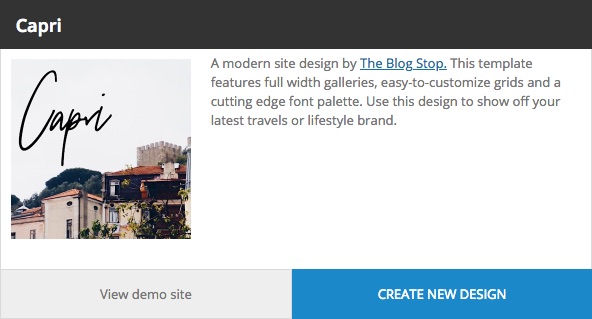
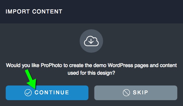
After the assets download, a popup will ask you if you would like to create the demo WordPress pages and content. Most people should choose “continue” so that the starting point is as close to the demo as possible.
Give your new copy a unique name and description so you can find it easily later.
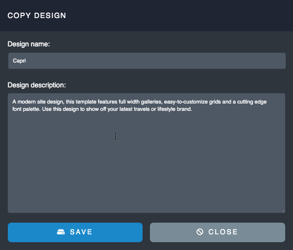
Click Save and the new copy will be added to your other saved designs further up the screen. When you’re ready, click Customize to start working with Capri privately or Go Live if you don’t mind it being live (perhaps it’s a new site).

Automatic page creation and layout assignment
A simple automatic onboarding process happens when you activate the Capri design copy. ProPhoto will automatically create the four pages it needs – Home, Blog, Portfolio and Contact. You will see these in “Pages > All Pages”
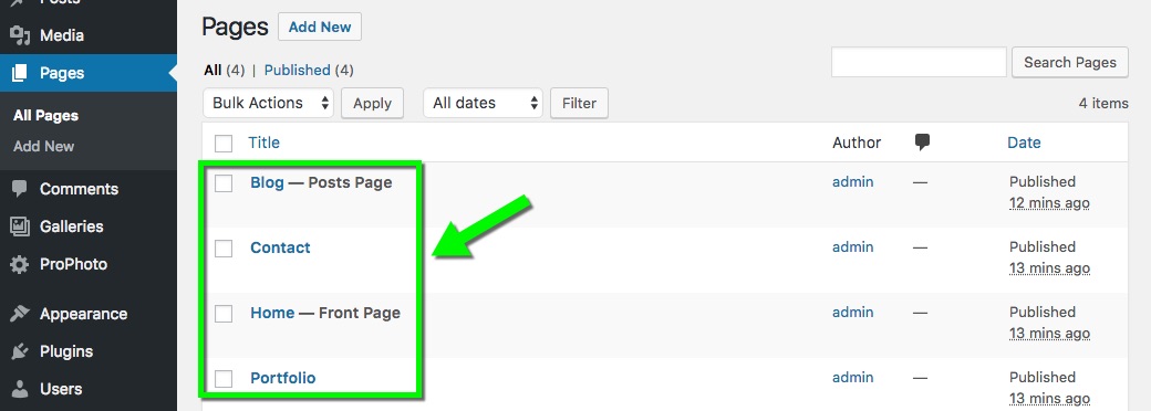
If you already have pages with those titles, the existing pages will be used. The pages titled Home and Blog will be designated as the “Static Front Page” and “Blog Posts Page.” All your pages will be assigned to their corresponding layout.
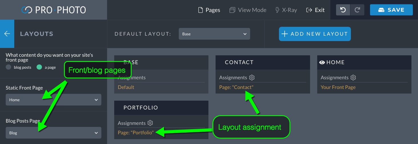
The links in the default menus will connect to these new pages, as well. What this all means is your site should look like the demo right out of the gate. Later on you can create more pages, adjust what page is the home or posts pages and create and assign more layouts.
Capri starts with four layouts.
- Home – for the static front page
- Portfolio – a layout specifically for your portfolio landing page
- Base – the layout that pages get when one is not specifically assigned. All but three of your pages use this layout by default
- Contact – A special layout specifically for your contact page.
You can assign new layouts to other WordPress pages any time. We recommend copying the default layout for new versions. It is easier then starting from scratch.
How to customize menus
Capri comes with five menus. These will all be set up by default and should work. But it’s common to want to customize these menus more. Check out the menus overview for details.
Here are the steps for editing any menu. A video below shows this.
- Enter the visual builder when viewing a page.
- Hover a block with a menu and click the lock icon. This unlocks a shared block.
- Click continue to edit the shared block
- Hover the menu module and click the editing icon
- Edit the individual menu items in the left sidebar or create new ones
Mobile Menu
The mobile menu is the same as the main menu; it’s just displayed vertically in the slide-over block. View and edit the slide-over block and mobile menu by using the “view mode” button and clicking the tablet or phone icons. The style of the mobile menu is changed via options in that menu module.
Create posts
If you don’t have any blog posts, now is a time to start publishing a few! Even if you create temporary dummy posts, it’s a good idea to have 5 or 6 so you can see how they will look. Add some text and at least one image to each post. The first image in the post or the featured image is what will be used as the thumbnail representing the post in grids and excerpts. You may want to review how to feature images. These don’t have to actually be inserted into the post. With some posts created you can see how the recent posts grid on the home page and the blog posts page are supposed to look.
Home Page Layout
At this point, it’s time to begin personalizing the front page with your own content using the Visual Builder. Enter the Visual Builder for the front page by clicking “ProPhoto > Customize” in the WordPress admin area or by clicking the customize button while viewing the page. The Visual Builder is where you will make all your ProPhoto content and settings changes.
Logo
The Capri logo is a simple tile with one text layer. Unlock the logo and navigation block, edit the module and see the list of tiles populate on the left. Find the Logo tile and edit it. Finally click on the text layer and change the text.
Call to Action Block
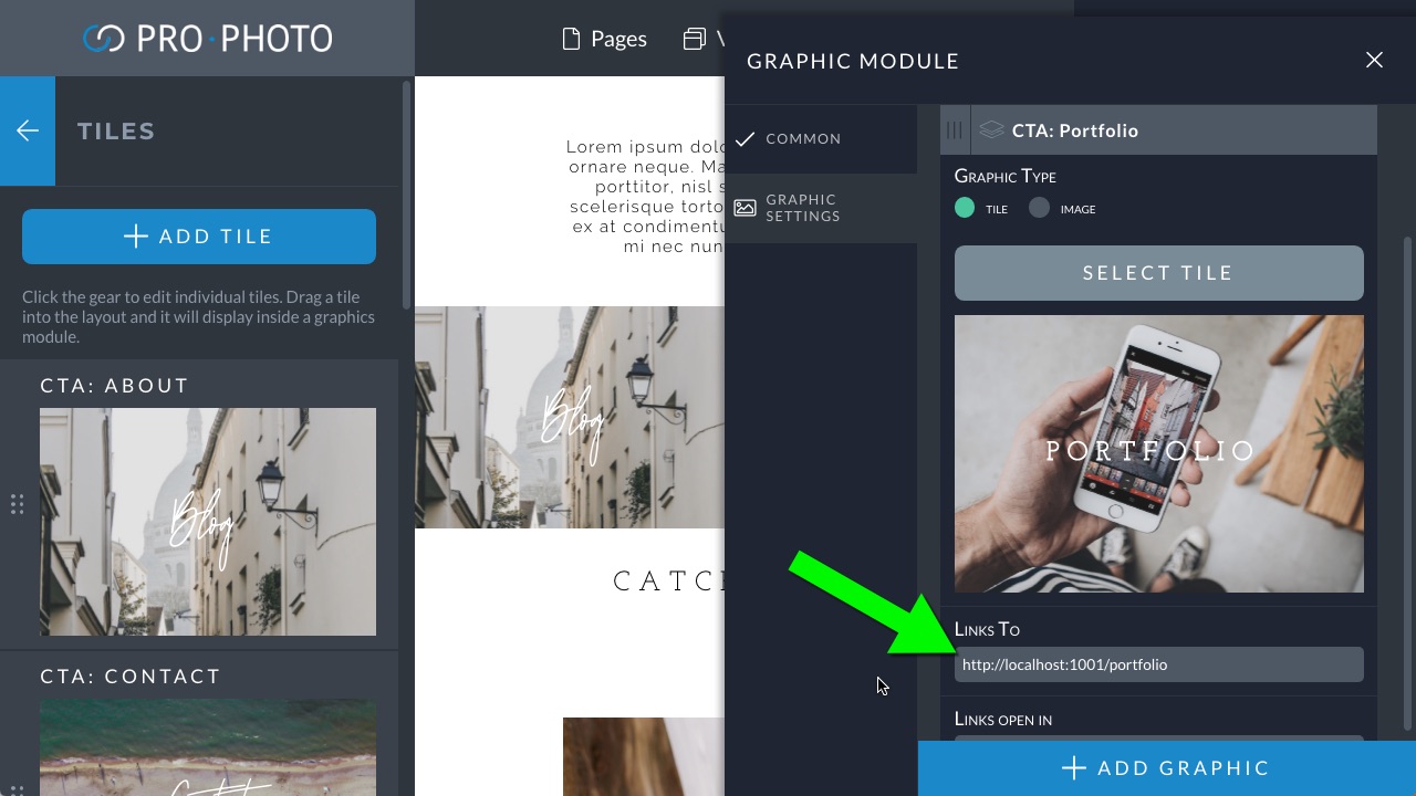
The linked images here are from three graphics modules, each in their own column. Each graphics module is displaying a tile. Edit both the image and the text in the tile editor, which opens up automatically when you edit a graphics module.
The graphics module itself is where you enter your own url.
Blog Posts Grid
The home page has a grid of recent posts. If you have published some posts they will appear here. Make sure each post has an image so that grid has an image to pull from. The style of the grid can be changed if you like. Simply edit the grid module and review the style settings on the left.
All individual grids have their own options for size, layout and columns in the Grid Settings area of the module.
Footer block
The footer block is present in all 4 layouts. You’ll want to edit the single graphics widget and paste in your own social media URLs. Delete any icons that you don’t need.
The logo tile here should be already changed. It’s the same tile used in the main logo. Your menu items should already be connecting properly.
Portfolio Layout

Switch to editing the portfolio layout using the Pages dropdown at the top.
Page Header Block
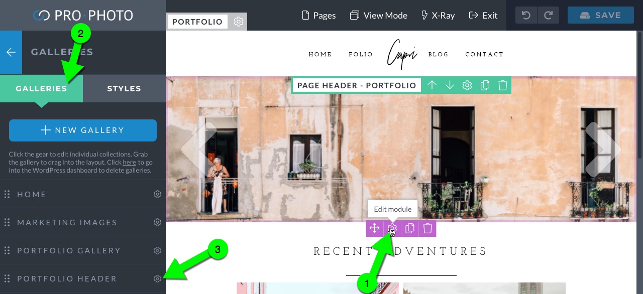
The block with the page header is all a single gallery. You can swap out images when editing the gallery module. You’ll see in the left column a place to edit individual galleries and gallery styles. You want to edit the “Portfolio Header” gallery.
Our galleries overview guide has more information on creating and styling galleries.
Portfolio Gallery Block
The second block is the actual Portfolio. It displays a different gallery with a thumbnail gallery style. Again, edit the gallery module, click the galleries tab, and edit the “Portfolio Gallery.”
Contact Layout

Switch to the contact layout by selecting the contact page from the “Pages” dropdown.
Page Header – Contact Block
The image in this block is from a graphics module. Edit the module to swap out the image.
Contact Form Block
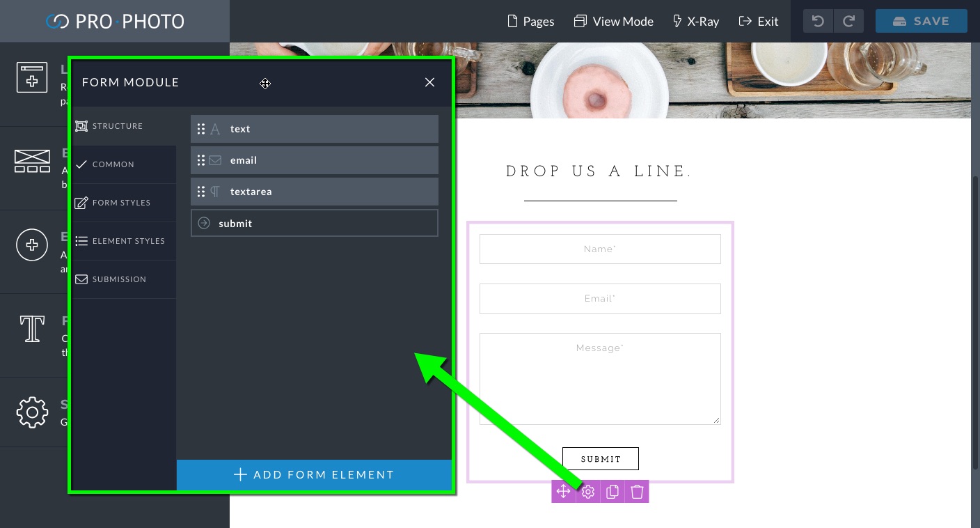
The form in the contact page should work out of the box. It will send submissions to your email address in “Settings > General”. Or you can set one specifically in “Settings > Forms.” Edit the style or content of the form by editing the form module itself.
Base Layout
The Base layout is the layout that applies to most of your pages and posts. That is because it is set to be the default layout. As such, to edit this layout simply navigate to any post or page (except Contact, Home and Portfolio) or archive page in the Visual Builder. Or, do the same from the front end and then enter the Visual Builder.
It’s a good idea to go to your blog posts page in the Visual Builder (again, using the pages dropdown is handy). You are looking at thebase layout there. The MAIN BLOCK is the block to concern yourself with. Inside this block is a WordPress Content Module, which displays the content you add to a post or page. Anything from WordPress displays in this module. Scroll to the bottom of this module to edit the style of the content displayed in that module. Review the content module overview for details. As an example the video below shows how to adjust the excerpt grid settings.
Take care not to delete this block or module!. If you do, none of the WordPress content will display. To edit style features in the content module for other page types, like single posts, view the Visual Builder on that page.
If you have questions about using different parts of your design, search this website for help, or contact us for guidance.


