Typically, horizontal navigation menus take up a lot of space in your website layout. On a wide computer screen with lots of room that is just fine, but on a smaller screen in another orientation (like a phone or tablet) your menu may not fit very well. This is where a special mobile menu slideout comes in handy, like this example:
As you can see, a special button can be used to expand a slideout menu from the side of the screen. (you can even change to the right side, and you can swipe to show/hide on touch screens) This slideout menu is hidden from view until needed, and looks attractive in a ‘tall’ browser orientation like a phone or tablet.
To add a menu to the slideout, or edit the menu that is there, in the Visual Editor, click View Mode and select “Phone”. Then, click the icon to open the slideout and you can add a menu to this slideout just like you would any other block. And then you can click to gear icon of the menu module in the slideout to edit the menu’s appearance, just like anywhere else in the layout.
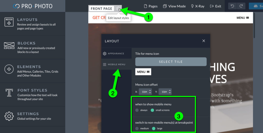
The mobile slideout menu can be set to appear always or on when the browser width hits 991px (large) or 768px (small). The controls for when the slideout menu appears are on the layout itself.