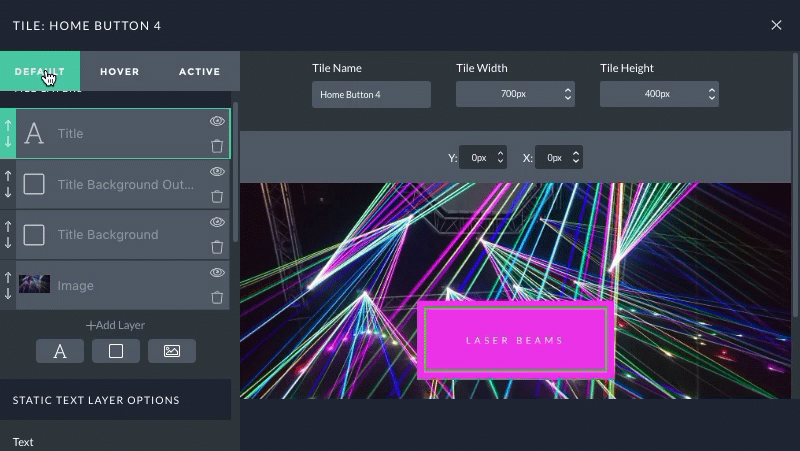
When creating a new tile, set the size before working on the layers. The size is a maximum width & height for the canvas you work with for a tile.
Tile size and dimensions
“What size should I use for my each tile canvas/max width & height?”
Tiles can be created at any max size you like, but there are a couple of guidelines you should be aware of:
Tiles will be downsized as necessary to fit in the layout.
Tiles will not be enlarged beyond the max width & height of the tile canvas.
Larger is generally better for a tile size.
Avoid making a tile excessively large … if your tile will only occupy a small area of the screen, keep the size reasonable.
If a tile will appear in a multi-column area of your layout, it will probably not grow beyond 1000 pixels wide even on very large screens. Think about where your tile will appear when setting the size for the best results.
Also be aware that tiles will scale proportionally – this means that all image, text, and shape layers are shrunk the same. Pay attention to text size! Your text might look great on a big monitor, but may appear too small to read on a phone screen. Use the ProPhoto View Mode tool to preview how a tile will look in context of the layout across various screen sizes.
Text layers
Text layers are used to create logos, overlay text onto button shapes, and lots more! Here is a demonstration of a logo tile and some text editing that is possible in a tile design:
use different text, font style, alignment, and much more
As you can see in that demonstration, a text layer can be modified with one or more lines of text, different alignment, opacity, rotation and more. Simply type whatever you want into the “Text” box in the sidebar for any selected text layer.
When you want to control color, font, size, italic, bold, etc. you will choose a font style that has been created with the appearance you need. If you don’t already have a font style that looks the way you want, click + New to add one, or Copy to duplicate an existing font style to make adjustments.
About “scale” and text layer sharpness
Text layers have a scale slider which can be used to grow or shrink the layer. This is a convenient way to slightly adjust the size of your text, but web browsers may not display your text in the best quality when scaled.
We recommend that you create a new font style which displays your text at the size you need for the best appearance in a tile, and reserve the scale control only for minor size tweaks or for hover effects.
Image layers
Image layers are used to add photos and graphics to a tile. See here for a demonstration editing an existing tile with a new image:
updating an image layer with a replacement photo
As you can see in that demonstration, an image layer can be modified with a photo uploaded from your computer, but you can also select existing photos from your WordPress media library.
Image layers can also use different opacity, rotation and more for different creative effect.
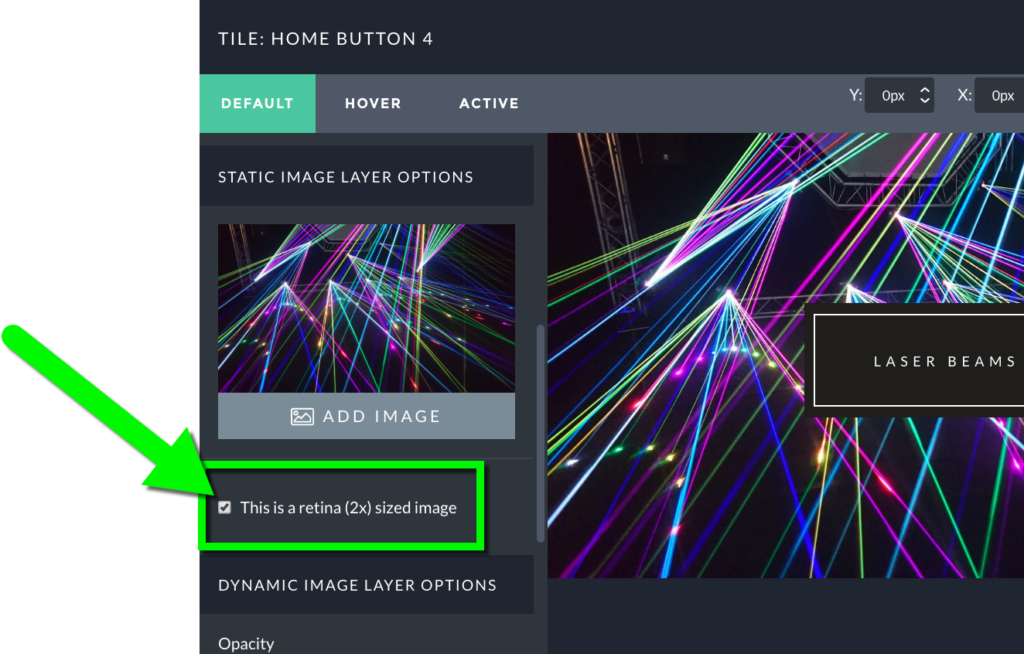
About 2x sizing, “scale” and image layer sharpness
When adding photos in a tile design, you will have the sharpest appearance if you select a photo at exactly 2x the size you need for your tile. This allows high-resolution screens on modern devices to use a higher quality for the best image clarity. In the video example above, the tile is 700 pixels wide so a photo at 1400 pixels wide fills the tile for the best fit.
Notice that the 2x option was checked:
check the 2x image size option for the best quality across all screens
The scale slider was also updated to 1.0 so the image can be shown without shrinking or growing for the best appearance.
We recommend using the 2x checkbox and scale 1 options for your images to appear their best in tiles. ProPhoto will automatically manage each tile to fit in your layout as necessary.
Shape layers
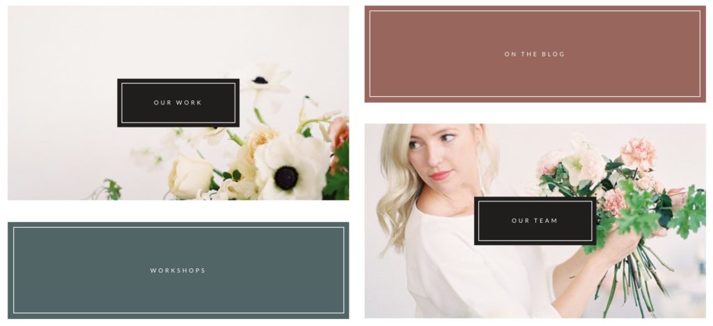
Shape layers can be used to create rectangles and ovals that are filled in with a solid color and/or outlined with a border. The most common use for shape layers is to create “button” areas in a tile, as seen in this example video:
customizing solid and border shapes in a button tile
As you can see in that demonstration, a shape layer can be a rectangle or ellipse, and can be modified different width, height, fill color, border width, border color, rotation, opacity and more.
By overriding the “hover” fill color of a shape layer, buttons can have eye-catching effects which make it obvious to visitors that your button is clickable.
Tile state, hover, and animation
At the top of the tile editing sidebar you can toggle between three states for your tile design: default, hover and active states, demonstrated here:
default state – this is how the tile will be seen normally on the page
hover state – this is how the tile appears when hovered over with your mouse (not used on touch devices without a mouse)
active state – this is how the tile appears when it has been selected (currently, only supported by the mobile menu button)
The state of each layer is customized separately, but you should start with the default state. Then, override any styling that you want to change by selecting a tile state and then modify the styling applied to the layer you have selected in the tile layers pane on the left.
Animation and motion
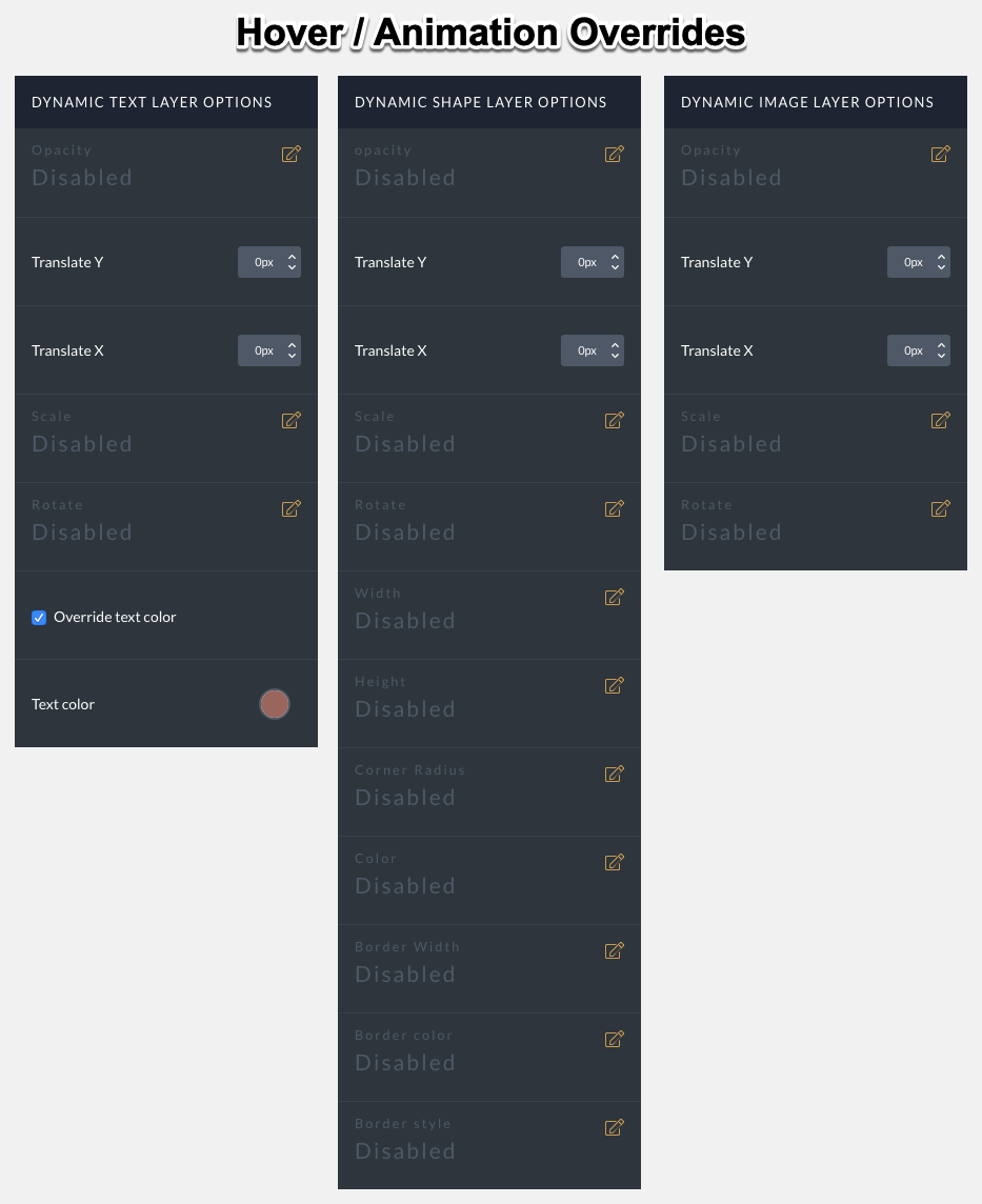
The hover and active states provide each layer type with different overrides that you can use to alter how the layer appears or positions in the tile canvas:
click to view enlarged
You can alter several options, depending on the layer type you’re working with:
opacity – raise or lower the opacity from fully transparent at 0 to completely opaque at 1
translate X/Y – move the layer horizontally/vertically
scale – adjust the size of the layer by zooming in or out; scaled layers may lose quality
rotate – spin a layer around its center point
text color (text layers only) – modify the color of the text without changing font styles
width/height (shape layers only) – modify the dimensions of the shape
corner radius (shape layers only) – modify rounding on corners of the shape
color (shape layers only) – modify the fill color of the shape
border width/color/style (shape layers only) – modify border appearance at the perimeter of the shape
To demonstrate several animation options, let’s review a typical “menu” button seen on mobile phones. This example uses multiple shape layers to form the background and line details of the menu button – changing the size, rotation, opacity, color, and other settings for each state of the tile gives us animation for an engaging button:
The fun doesn’t end here! You can move around image layers, as well. Remember: each layer can have its own animation and hover effects, so you might edit multiple layers at each state to fully customize hover appearance.
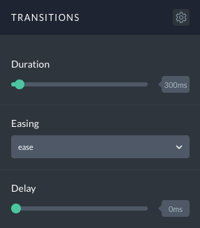
Using transitions to control speed and delay
The hover and active states will also provide you with transitions controls which may be used to change the behavior of each layer’s animation.
duration – edit the speed of the transition between states; a duration of zero will look instantaneous
easing – edit how the transition timing appears in action; “linear” will animate at a consistent rate, “ease” will smooth in-and-out of each transition, “ease-in” will smooth into each transition and end abruptly, “ease-out” will start abruptly and smooth out of each transition, and “ease-in-out” is just like “ease” but with a more gradual beginning of each transition … experiment with each type to see the subtle differences
delay – edit the wait time before the transition begins
Here is a demonstration video showing a menu button that has lines set to slightly different durations and staggered delays:
tile design with staggered delay and duration for layers
Adjusting timing & behavior can have a very cool, dynamic effect on tile designs which have multiple layers. Experiment with transition timing and behavior for subtle but effective interaction with that “wow” factor!


