When visitors land on a web page or a blog post on your site, you can use call to action items to increase interaction, including through social media on Facebook, Twitter, Google+, etc. These call to action items appear below the pages and posts where you have enabled them.
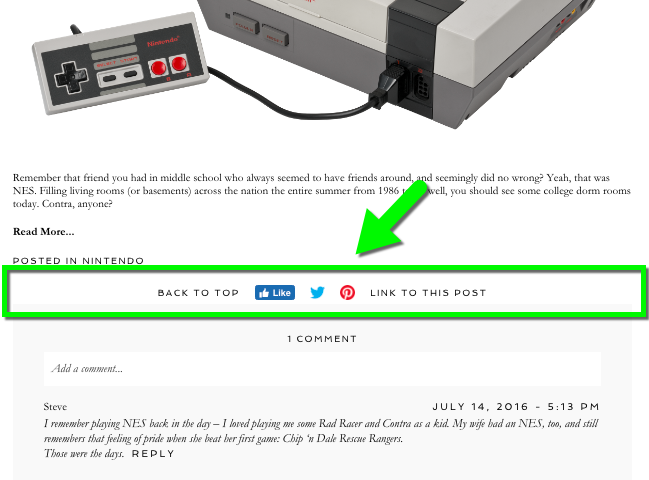
Build a call to action area
Use the call to action builder screen to create the structure of items which appear below your content.
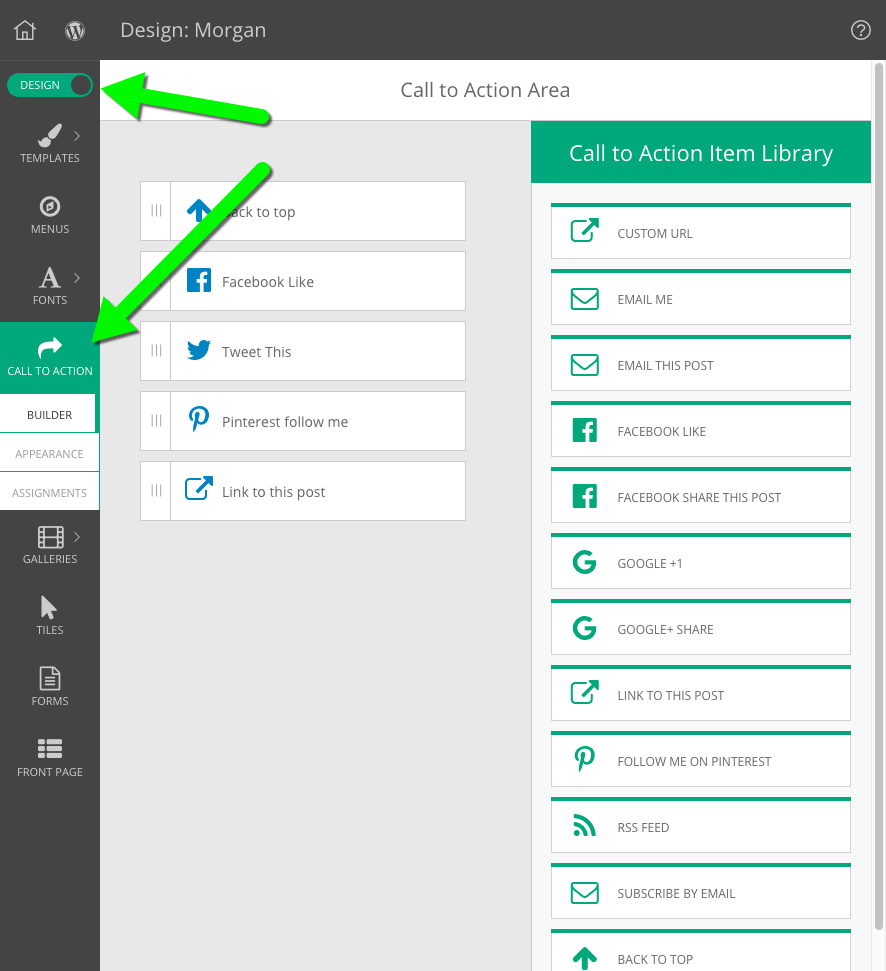
Along the right side, you will see all the available types of call to action items you can use. Most of them are self explanatory, but here is some detail about a few which might not be obvious:
- Custom URL – this type is useful if you would like to link to one specific address online, such as a YouTube channel, a LinkedIn profile, or some other site that isn’t already an option for your call to action tool.
- Email me – fill in an email address, and anyone who clicks the link will be presented with a blank email on their device, pre-addressed to the email filled in during setup.
If you want to link to a ProPhoto Form on your site, use a Custom URL item to link to your page address. - Subscribe by Email – this type integrates with the Feedburner service, so visitors can be notified by email each day that you have new blog posts. Learn how to setup these tools in our RSS Feed guide.
- Back to top – this type provides a link which scrolls to the top of the site.
Link with text, image, or tile
When you add a call to action item, select between a text link, an image link, or a tile link.
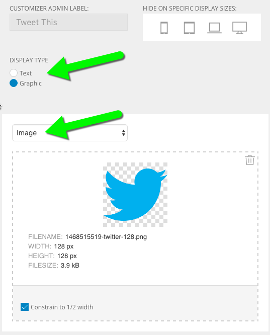
- Text – your item will be a simple text link which you can style with the call to action Appearance section (see below)
- Graphic – your item will appear as an image you upload, or as a ProPhoto tile design you have created.
When using an image, use the Constrain to 1/2 width checkbox to help your image look extra sharp on high-density displays, such as Apple Retina screens. You can also limit how wide your images or tiles appear with the Appearance section explained below.
Style the call to action appearance
Use the call to action appearance screen to change the styling of your items. (to use images or tiles for your items, see the build section above)
Change call to action text link styling
In this area, select a font style from your library. If you want to use a style that is created specifically for your call to action items, visit the “ProPhoto > Customizer > Fonts > Font Styles” area first.
 Since the call to action text links will appear as links and not as plain text, make sure that the font style you’ve chosen has the proper color, hover color, letter spacing, underline, and other appearance options in the font style preset you’ve selected.
Reposition call to action section
The call to action strip can appear above or below any comments section of your page, and can also be aligned left, center, or right on the screen.

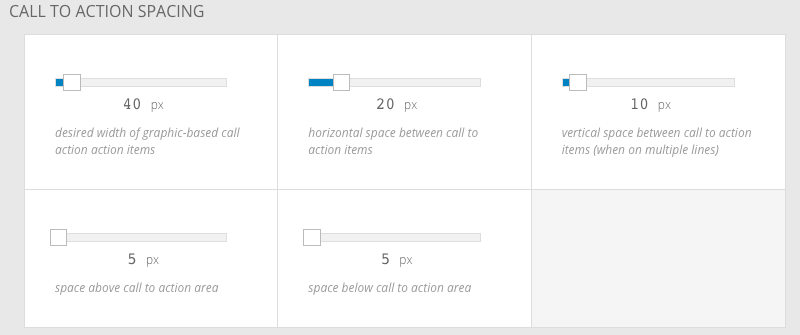
Adjust spacing between and around items
Using slider controls in this screen, you can set a preferred width for call to action items which use images or tiles. You can also change the gap between each item, and control padding above and below the entire group of items.
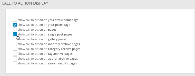
Assign call to action to show/hide on page types
Use the call to action assignments screen to turn on or off your call to action group for certain page types. Unchecked page types will not display the call to action area at the bottom, while checked page types will display them.
At the moment, there is not an option to enable/disable the call to action section on individual pages or posts, but it is possible to use CSS code to hide them. Contact us if you need help with this.


