
ProPhoto Tiles are layered graphic elements created within the ProPhoto user interface in “ProPhoto > Customizer > (toggle “Template” to “Design” at the top-left) > Tiles”

Put simply, a tile comprises one or more text, image, and shape layers. Each of these layers has several options for both the default and hover states. Use these two states to create custom movement and animation when the tile is hovered with your mouse.
Tiles can be used in a graphics widget, a custom form submit button, and a read more link in grid items.
Create or copy a tile
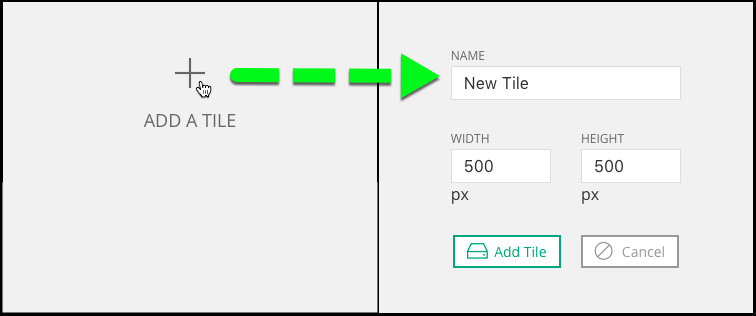
Click Add a Tile to begin creating a new tile. You’ll first be asked to enter a name and the tile maximum dimensions. Tiles will be downsized to fit, when necessary, but will not be enlarged beyond the size you specify here. The name and dimensions can be changed easily later.
It is also common to create a series of similar-looking tiles each with minor differences. To save time, copy an existing tile you have in your “Tiles” screen.
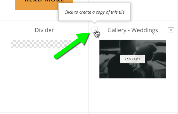
After making a copy, you can simply tweak any text layers, image layers, or shape layers that you want to change for the new iteration which is much faster than recreating a similar tile from scratch. Then, all you have to do is make use of the new tile copy you’ve made.
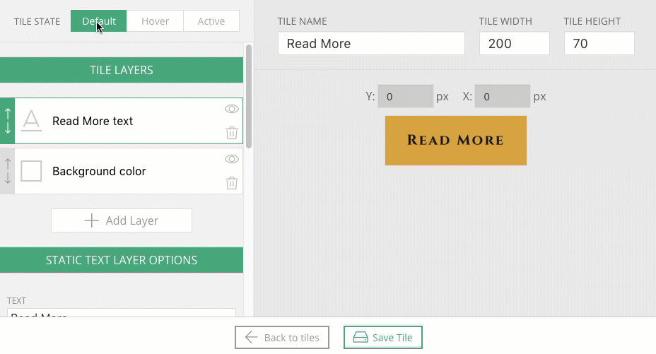
Tile layers
After clicking the blue Add Tile button you land in the tile editing area. Before you can do anything else you must add at least one tile layer. If you’ve ever worked software like Photoshop you are likely familiar with the concept of layers – separately editable elements that together make up a whole graphic.
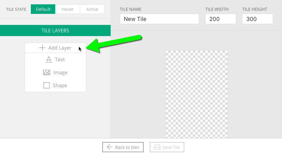
Normally a tiles consists of multiple layers. After a layer is added the next step is to add text, upload an image, or choose a shape type. Perhaps there’s text over an image, or a partially transparent shape that appears on hover for a slight color change. Learn more about what’s possible with each layer type in our Customize a tile layer tutorial.
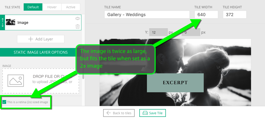
Retina images (for high density displays)
Tile state
At the top of the tile editing sidebar you can toggle between the Default, Hover, and Active states for the tile.
- Default state – this is how the tile will be seen normally on the page
- Hover state – this is how the tile appears when hovered over with your mouse
(not used on touch devices without a mouse) - Active state – this is how the tile appears when it has been selected
(currently, only supported by the mobile menu button)
Here is a demonstration of a tile design with three states, each showing a few differences from the others:
The state of each layer is customized separately, but you should start with the default state. Override any styling that should be changed by selecting a tile state and then modify the styling applied to the layer you have selected in the tile layers pane on the left.
There are so many options for editing layer states to create animation and movement that we’ve created Add movement to a tile to help explain all the options.
Responsive behavior
Like all ProPhoto design elements, tiles are responsive. They will expand and contract as necessary to perfectly fit the current browser window size. However, it’s important to know that they will not expand more than the width and height set for the tile. So if you want your tile to be able to grow to 900px in width, you’ll want to make sure you set it’s width at 900px and add images that are at least that wide.
Frankly, it can be hard to conceptualize a tile without looking at an example. Check out “” to receive a careful walk through of how we created some specific example tiles.


