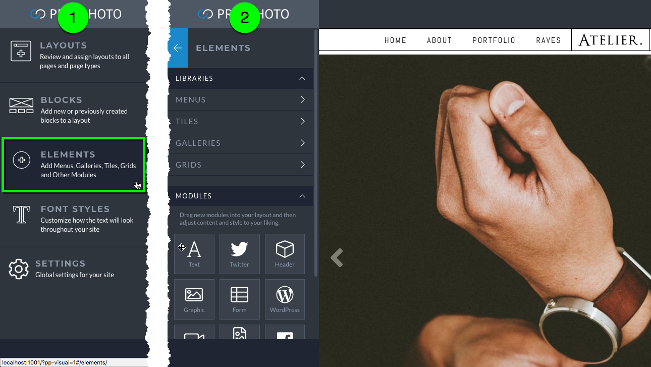
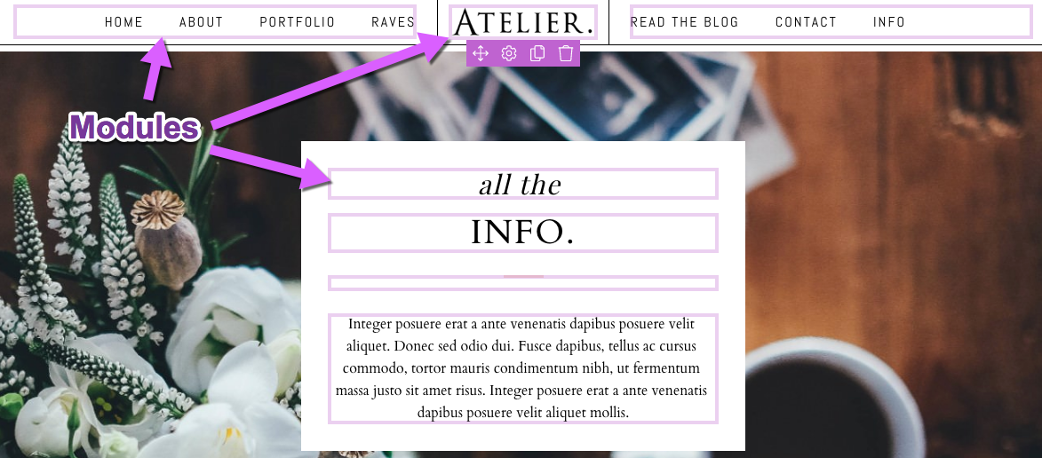
Modules are what you use to add elements to your layout. If you want a menu at the top of your site you add a menu module in one of your topmost blocks. If you need a chunk of text at the bottom of your site you add a text module to one of your lower blocks. The video below shows a module being added from the main Elements area.
When adding a module that has saved versions or styles, first enter its library and then drag it in place. The video below demonstrates entering the tiles library and dragging a tile in place.
After dropping into the layout, most modules will automatically show the editing popup, as shown in the video above. To edit a module at any time, hover over it and click the gear edit icon.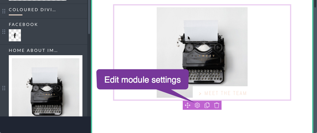
At a minimum there will be a place to edit common settings like space above and below. Most have a module specific settings area as well. 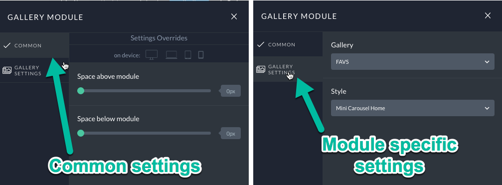
Editing modules in shared blocks
A cool feature of blocks is that they can be reused. When you want to edit a block that is shared between multiple layouts you first unlock it by clicking the lock icon.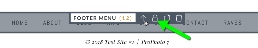
Then choose whether you want edits in that block to apply to all instances of that block or if you would like for that block to be unique and no longer shared. 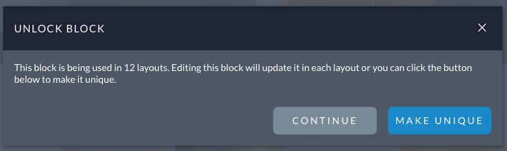
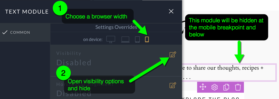
Changes at specific widths
If you don’t want a particular module to be visible when the site is viewed at a certain width then check one of the icons in the common settings area that corresponds to a specific width. There are more details and a video example in our responsive options tutorial.
To spice up your site display, entry animations can be applied to any module. The animation is applied as soon as a viewer has viewed enough of the page so as to fit the entire module.
To apply an animation, click to edit any of the modules in your layout, and then select the “Animate” tab in the module’s settings.
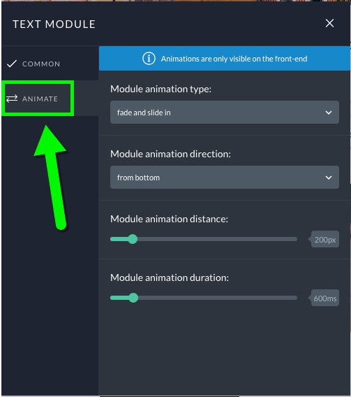
There are four options to choose from when setting up an animation
- Animation type: Mix and match between a fade or slide in effect.
- Animation direction: Choose the direction from which the animation starts.
- Animation distance: The greater this pixel value, the greater the movement. This number is the distance the widget will travel to get to it’s resting place.
- Animation duration: Set the number of milliseconds for the animation.
As noted in the settings, be aware that module animations can only display on the front end of the site; they can’t display in the Visual Builder itself.
Play the video below to preview a few different animation possibilities.
Throughout your site text is styled via “font styles” that are chosen in specific areas. These style are created and managed in the customizer under “Font Styles”. See our fonts overview for more details. Text module font styles are assigned on a module by module basis. When you click inside a text module the customize menu will show the editing context for that specific font style.
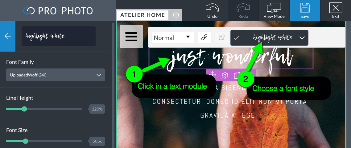
Chose a font style for a text module
Grids have a library of styles you can save and apply. So when you edit a grid module, the sidebar populates with the editing context for that particular grid style, where you can choose a different font style.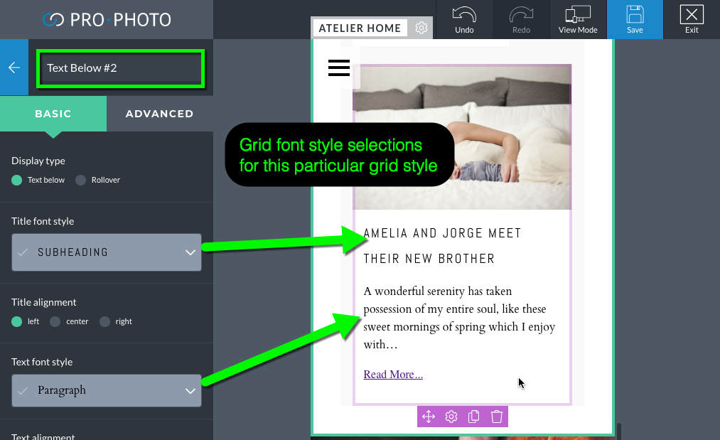
Text in tiles have a font style applied in the tile editor. When you edit a graphics module that’s displaying a tile, the sidebar will show the list of tiles to edit. To edit the font in the tile, simply edit the corresponding tile layer, as shown below.
A copy can quickly be made of any module. Edits to this copied module are independent of the original. Click the copy icon on the widget. That will trigger a paste icon to be in the left column. Drag the copy icon into place.
Modules are placed inside columns, which rest inside of rows, which are inside of blocks. As such the location of your module primarily determined by it’s position in the layout. The alignment and spacing of modules inside columns is controlled via the “common” options available in the module editing popup.

 While viewing a page in the Visual Builder modules are added from the “Elements” tab.