
What is a WordPress ‘widget’?
In the most basic sense, WordPress widgets are chunks of content that you can add to any area of your setup to receive them. Traditionally, widgets are added to “sidebars” of various types in “Appearance > Widgets”. Over the years we received a lot of feedback expressing a desire to have more flexibility for where widgets can be displayed. Based on this feedback we supercharged the widgets area and brought it inside the ProPhoto “Customizer.”
Widget Types
- Featured image widget
- Form widget
- Gallery widget
- Graphics widget
- Plugin widgets
- Post/Page header widget
- Spacer widget
- Video widget
- Menus widget
- Grid widget
- Text widget
- Facebook page widget
- Google+ widget
- Twitter widget
- Pinterest widget
Add a widget
In “ProPhoto > Customizer > “Layout” widgets are used to add content to the overall layout of the site. If you want a menu at the top of your site you add a menu widget in one of your topmost columns. If you need a chunk of text at the bottom of your site you add a text widget to a column in one of your lower blocks. Clicking the add widget button opens a popup showing all the available widgets. 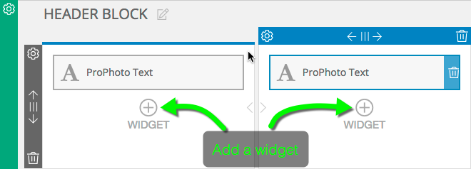
The default WordPress widgets are shown in black and the ProPhoto-specific widgets have blue highlights. 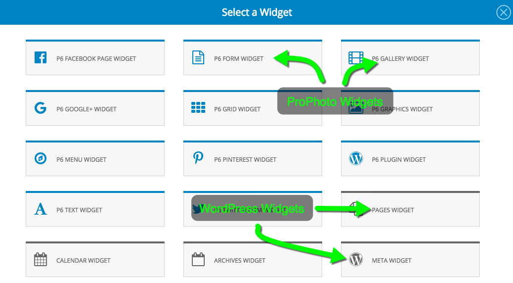
Choose a widget, then select options, fill in title and text for that widget and click the “create widget” button.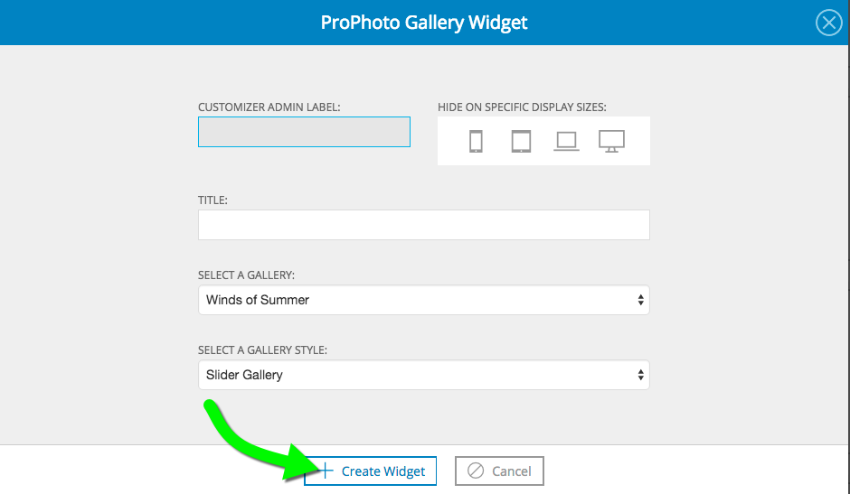 You can add as many widgets as you like to your layout template and any child templates. A widget added to a parent template will be inherited by any child template whose column inheritance is intact. Intact column inheritance is indicated by a tan colored fly-out for the column.
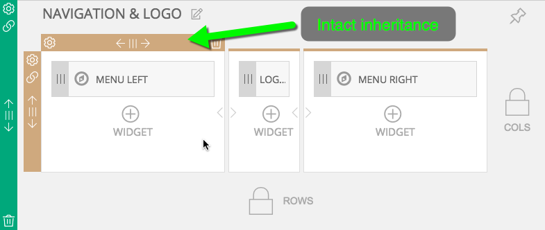
A widget added to this same column in the parent template will display here automatically
Edit widget contents
To edit a widget simply click on it in “ProPhoto > Customizer > Layout”, make your selections and save your changes. Before you make a change to a widget, though, be aware that those changes will apply every instance of the widget. Widgets can be shared by multiple templates.
Widgets shared by multiple templates
When first created, a child template contains all the same widgets as it’s parent. The same goes for a copied template. It is not created with independent copies of the widgets. As such, editing a widget in one template can result in that change being visible in other templates. Obviously this can be confusing. So ProPhoto warns you when you are about to save any edits to a widget. A small triangle shows up next to the save widget button. The number inside represents the number of templates sharing that widget. Hovering the triangle gives more explanation. 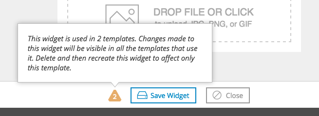
If the goal is to edit a widget inherited from another template to that it is unique to a specific template, then delete the inherited widget and create add a new widget of the same type.
Widget admin label
Some layouts feature a lot of widgets. To help keep track of what each one is, enter a label in the “customizer admin label” field. This will only show up in “ProPhoto > Customizer > Layout”.
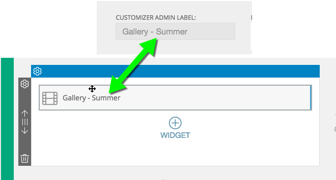
custom admin labels help identify widgets in the layout
If no admin label is applied, a default term like “menu” or “images” will apply.
Hide widgets at certain viewport widths
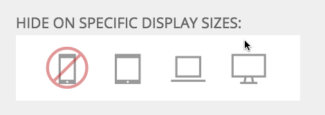
If you don’t want a particular widget to be visible when the site is viewed at a certain width then check one of the icons that represent a specific width. There are more details and a video example in our responsive options tutorial.
Widget Entrance Animations
To spice up your site entry animations can be applied to any widget. Click on a widget in “ProPhoto > Customizer > Layout” to see the animation options at the top of the popup.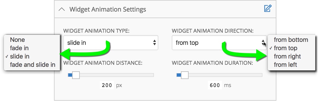
The animation is applied as soon as a viewer has viewed enough of the page so as to fit the entire widget. There are four options to choose from when setting up an animation
- Animation type: Mix and match between a fade or slide in effect.
- Animation direction: Choose the direction from which the animation starts.
- Animation distance: The greater this pixel value the greater the movement. This number is the distance the widget will travel to get to it’s resting place.
- Animation duration: Set the number of milliseconds for the animation.
Play the video below to preview a few different animation possibilities.
Style widget text
The styling of your widget text is controlled within your layout appearance customizations. For full info about this, please see our guide on applying font style within your template.
Generally, it’s best to apply style changes at the top template level of your base template. This way, your styling is applied consistently through all of your templates.
You can always override the styling in particular templates, or certain parts of a template.
Copy widgets
A copy can quickly be made of any widget. Edits to this copied widget are independent of the original. Click the copy icon on the widget. That will trigger a paste icon to be in every column next to the icon to add a widget. Paste the widget in any column.
Widget spacing
The alignment and spacing of widgets is controlled via the “widget spacing” option available for columns in the layout editor.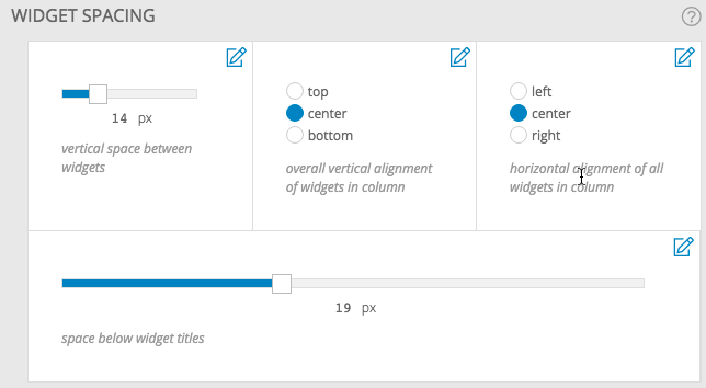 Apply the same settings to all widgets in a template by editing the “Template” layout item or override the widget spacing setting for a specific row or column. Check out Control the appearance of your template layout
to learn more about how to apply the widget spacing you desire. If you need custom spacing between different widgets in the same column then use the Spacer widget
.
Apply the same settings to all widgets in a template by editing the “Template” layout item or override the widget spacing setting for a specific row or column. Check out Control the appearance of your template layout
to learn more about how to apply the widget spacing you desire. If you need custom spacing between different widgets in the same column then use the Spacer widget
.


