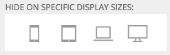
You may find that some of your widgets don’t work that well at certain viewport widths. ProPhoto gives you the option to hide any widget at one of 4 different display sizes. Edit the widget in “ProPhoto > Customizer > Layout” and click the sizes for which you want to hide it.
- less then 768px – “mobile”
- 768 to 991px – “tablet”
- 992 to 1199px – “laptop”
- 1200px or more – “desktop”
|
 |
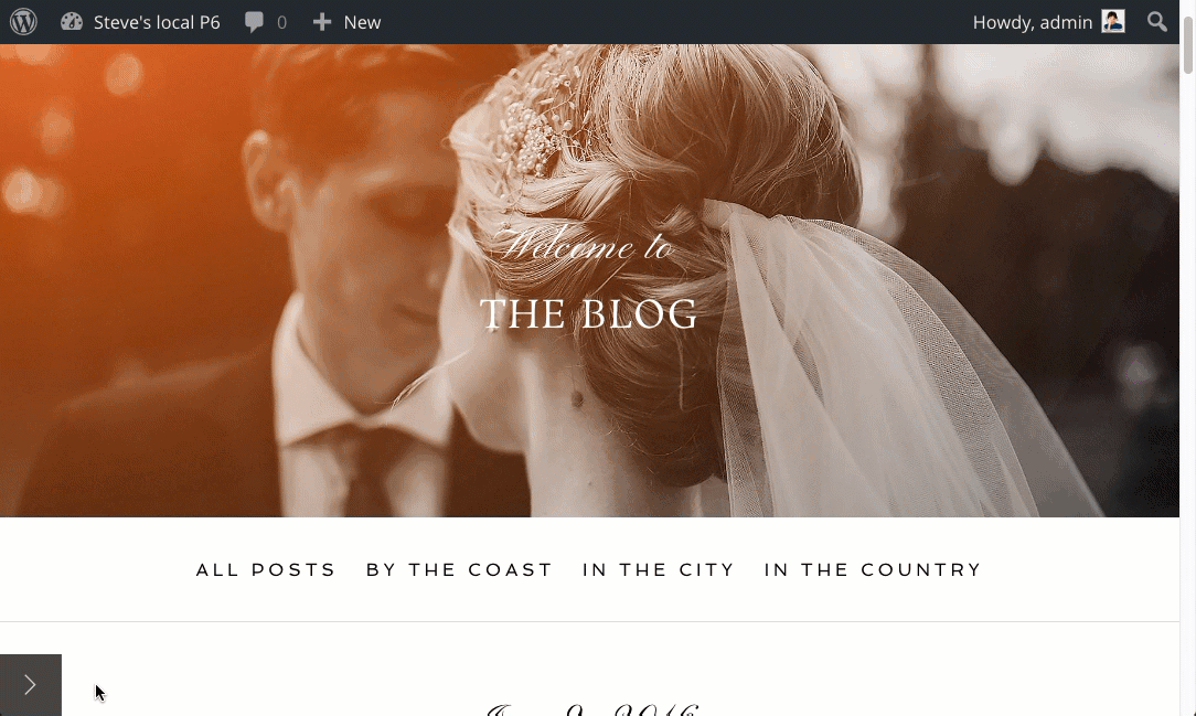
In the example below, watch how the graphics widget disappears when the browser width crosses that 768px breakpoint.
Layout entities are the blocks, rows and columns in each template that make up your overall site layout. ProPhoto provides breakpoint customization options for each of these entities. Review these options in full in our Responsive appearance settings
guide. Just like with widgets you can hide layout entities at certain display sizes.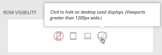 You can also customize each entity and have that customization ONLY apply to specific display sizes.
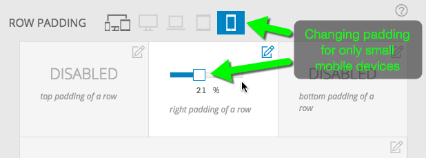
This can be quite handy if, for example, you want full width galleries on small devices to maximize the screen size but a little padding around them on larger displays.
Besides your content from posts and pages, your layout items are handled via widgets, which are added to columns inside of rows, inside of blocks in “ProPhoto > Customizer > Layout” . Learn more about layout entities in general at “Layout editor
.”
Rows can receive a “max width” setting that gives you control over how wide your site, or certain areas of your site can expand to be. 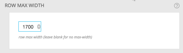 For example, perhaps you want a full width gallery to expand without limit but you want your text below that to be restricted to 1500px. Row max width allows you to do that.
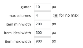 Each grid on your site, whether inserted as a widget or directly into a page, has some options that affect how the grid items are sized and laid out for various different display sizes. You can determine how much space will be between grid items, the max number of columns, the minimum and maximum width for the thumbnails, and your “ideal” width. For more details and a video check out our grid sizing guide.
By default ProPhoto will determine when is the right time for side by side columns to stack. If you want more manual control over this stacking check out the breakpoint column stacking section of our “Responsive appearance settings
” guide.