Each design has one template layout item, which serves as the top level of your template layout, seen in the editor at the top left of “ProPhoto > Customizer > Layout.” It does two main things in your design: it acts as a container for all the block items in your design layout, and it stores your main appearance settings. Our other guide explains how to control the appearance of layout items, so we’ll move on to learn about the next layout item.
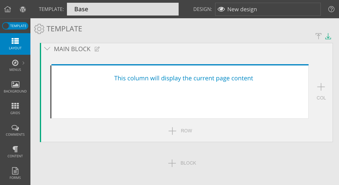
Inside the template item you will find block layout items, which act as the second level of your layout, seen in the editor with a green left edge. Each block can be visually expanded and collapsed for easier organization and easier drag-and-drop.
left-side arrows collapse each block, while icons at the top-right collapse/expand all blocks at once
Blocks are added to the template item to divide it into horizontal areas. You may have only one block in your design, like our example above, or you may stack several of them inside your template item.
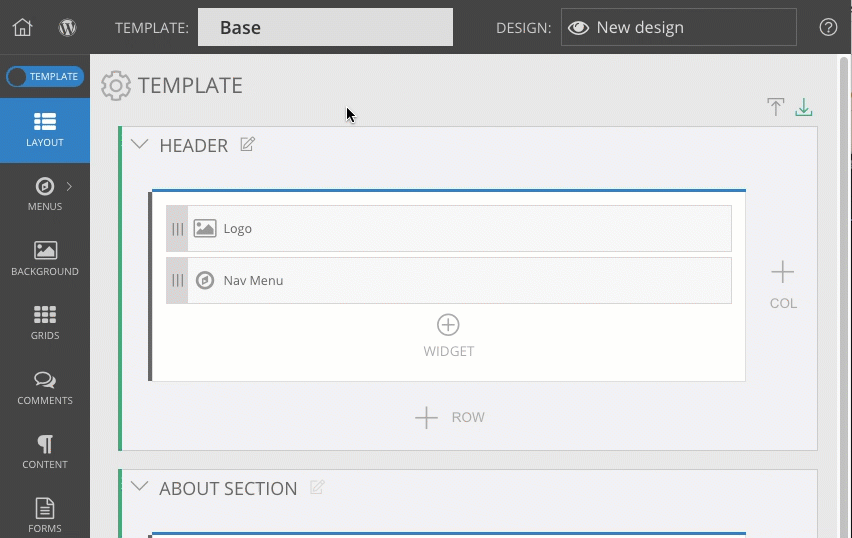
Typically, websites have distinct regions like a header area which might hold a logo and navigation menu, a content area which might have main content and sidebar columns, and a footer area which might have social media icons and sponsor badge links. You can set up regions like these by using three blocks in your layout.
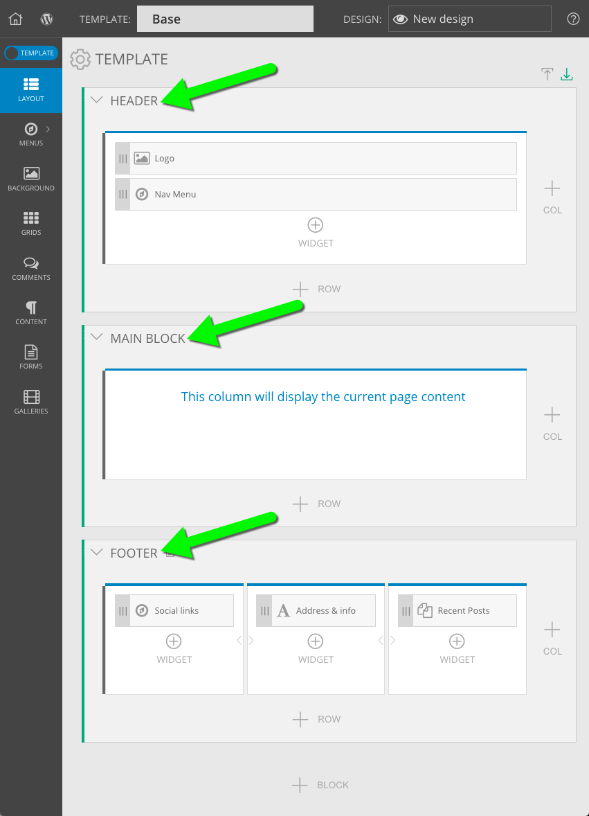
the page is divided into three blocks – header, content, and footer
You may even give each block a custom name to help yourself keep track of the purpose for each block in your layout. Block names aren’t seen by visitors – they’re just for your own organization.
edit the title of blocks for easier layout organization
All blocks inherit appearance settings from the parent template layout item, mentioned in the section above. Our other guide explains how to control the appearance of layout items if you want to override the style of certain blocks.
Inside block items you will find row layout items, which act as the third level of your layout, seen in the editor with a gray left edge.
Rows are added to block items to subdivide them into horizontal strips. You may have only one row in a block, like our example above, or you may stack several of them inside a block when you want to stack things on their own lines.
For example, a header area block might have two rows: the top row for holding a business logo in an graphics widget, and a bottom row for holding a menus widget.
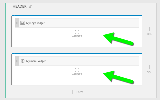
two rows for holding the logo and the menu
All rows inherit appearance settings from the parent template layout item, mentioned in the section above. Our other guide explains how to control the appearance of layout items if you want to override the style of certain rows, or all rows within a certain block.
Inside row items you will find column layout items, which act as the fourth level of your layout, seen in the editor with a blue top edge.
Columns are added to rows to subdivide them into vertical strips. You may have only one column in a row, like our example above, or you may use up to six columns when you want to place things side-by-side in a row.
For example, a header area block might have a row which has two columns: the left column for holding some links to stuff on your website with one menus widget, and the right column for holding some social media icons/links in a second menus widget.
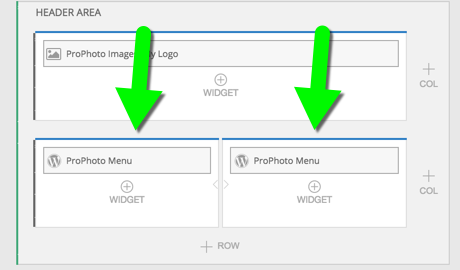
two side-by-side columns to hold menus widgets
All columns inherit appearance settings from the parent template layout item, mentioned in the section above. Our other guide explains how to control the appearance of layout items if you want to override the style of certain columns, or all columns within a certain row or block.
Each of the items explained in the sections above simply help you create the layout of your design. They’re mostly just container items, and, except for background images, don’t actually show any content.
Your content is the actual stuff of your layout – photos and text you add when you create web pages or blog posts in WordPress. Or the navigation links & menus you’ve created in ProPhoto. Or automatic grids of thumbnails created by ProPhoto. Basically, content is the stuff you probably care about most, and widgets are placed in the columns of your layout to add stuff in each area.
There are too many widgets to describe here, so go find all the details in our separate widgets guides.