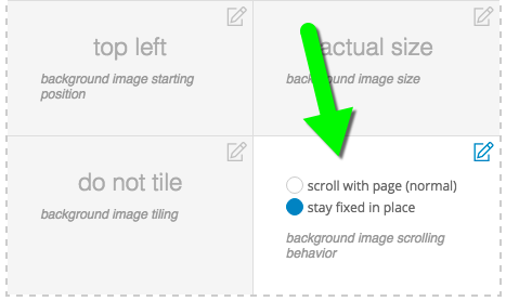
You will also find additional options for controlling the position and behavior of the background image. Click to read about each control:
When using a background image, you may control its position. Several options are available for position, each placed in the respective spot in this table:
| top left |
top center |
top right |
| center left |
center center |
center right |
| bottom left |
bottom center |
bottom right |
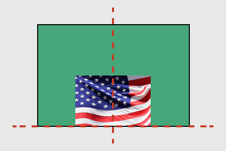
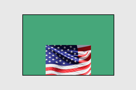
The image will be placed, relative to the edges of the layout item, in the location you select. For example, bottom center will align the bottom edge of the image to the bottom edge of the item, and will align the horizontal center of the image with the horizontal center of the item, like this illustration:

background image positioned bottom center of green element
Like other settings, this image position can be applied in the Base template of a design, and inherited into all child templates. Or, you can override the settings in different child templates.
Background images have a width & height shown in the file details after upload, but you can use the size control to affect how the image is applied to the site. A few options are available for size, each defined below:
- actual size: no scaling, with cropping.
This will fix the image at 100% size as the site background without scaling. Portions of the site background will remain uncovered by the image if it is not large enough, and the image will be cropped away where it is larger than the element. It is rare to use this option for a site background image, due to the variation of devices & screen sizes which will view your site.
- contain image within element: with scaling, no cropping.
This will fit the image behind the site by scaling to the edges of the page. Background area will remain uncovered if the aspect ratio of the image is different from the aspect ratio of the page. Since web pages will vary in length, this option will provide different results on shorter & longer pages.
- cover entire element with image: with scaling & cropping.
This will fill the image behind the site by scaling to the edges of the page. Background area is covered completely, but the image will be cropped away where it becomes larger than the page. Since web pages will vary in length, this option will provide different results on shorter & longer pages.
Since background sizing can create different results for different screen sizes and aspect ratios, you should test your design to make sure images look and behave the way you want. Use different window or screen sizes to check. If images look too grainy or pixelated when they are scaled, try uploading a larger resolution of the image for your background.
Background images have a width & height shown in the file details after upload, but you can use the tile control to affect how the image is repeated behind the page when the image is too small at actual size. The options are each defined below, followed by an example:
- do not tile: if the image is too small for the site background area, it will not be repeated. (see section above for cover and contain options)

do not tile example
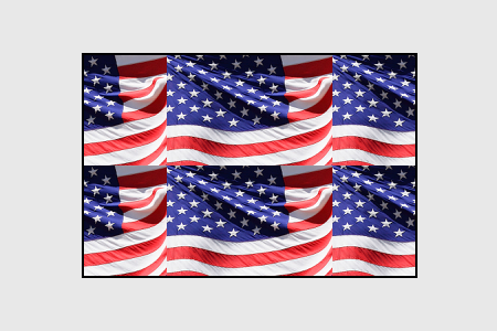
- tile: if the image is too small, it will be repeated horizontally and vertically as needed to fill the site background area.

tile example
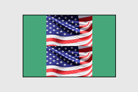
- tile only vertically: if the image is too small, it will be repeated vertically only as needed to fill the site background area.

tile only vertically example
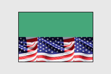
- tile only horizontally: if the image is too small, it will be repeated horizontally only as needed to fill the site background area.

tile only horizontally example
Tiling is typically not used in combination with the cover size option explained in the image size section above, but may be used when actual or contain sizing is selected.
Background images are usually set to scroll with page, but you can also choose to have backgrounds stay fixed in place.

When a background is set to stay fixed in place, it appears stationary in the browser, even while scrolling. The image position (see the section above) will be relative to the browser window, and not the entire site length. This means that bottom center is the bottom center of the browser window, regardless of where the length of the page. For example:
Typically, stay fixed in place is applied to this site layout item background image, since it is the main background of the site. But this option may be applied to the background of blocks, rows, or columns for a cool layered effect often called a ‘parallax effect’.
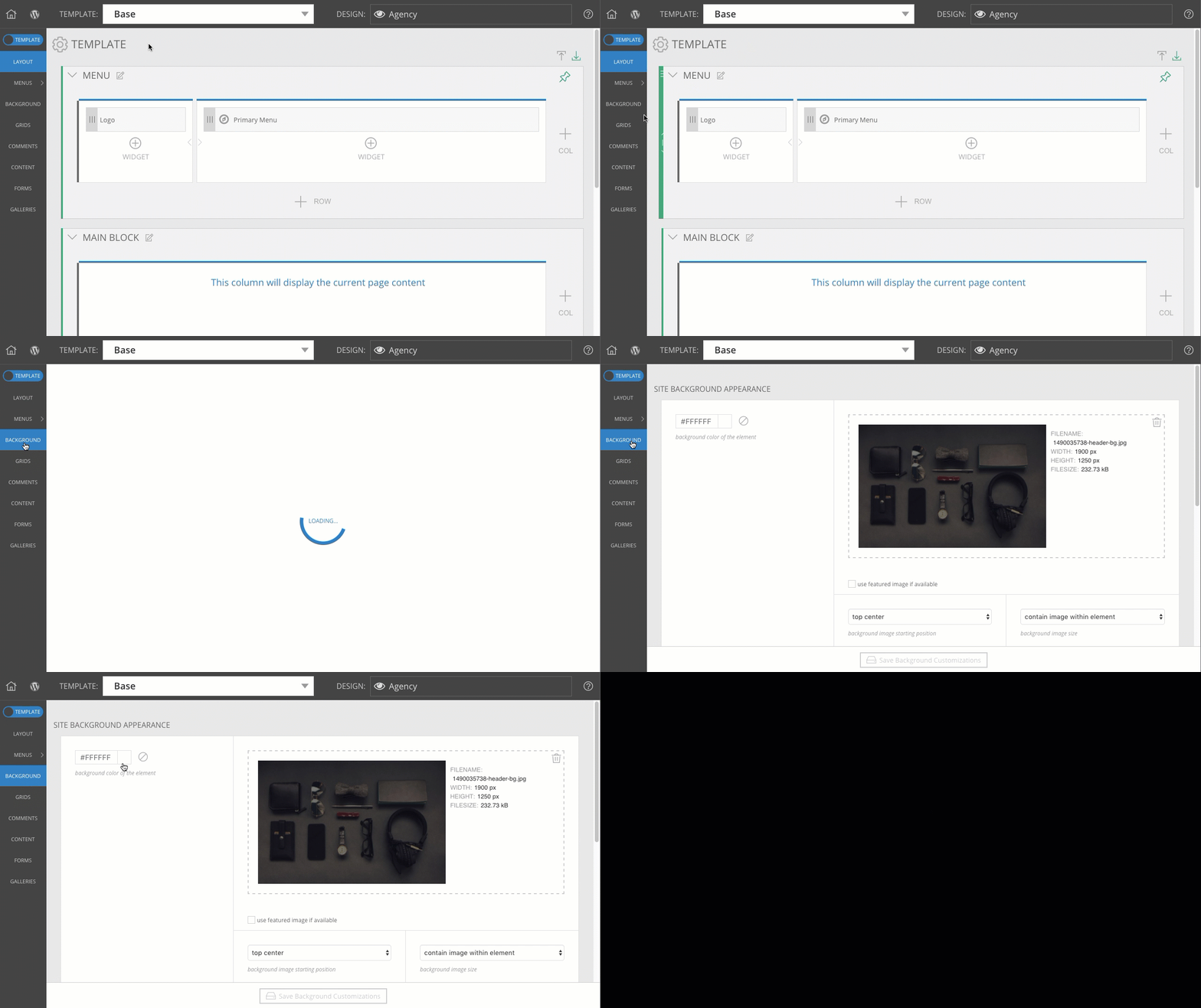 Your settings will typically be applied here when you have selected the top-level Base template of your design, but these options can be overridden on a per-template basis, when necessary.