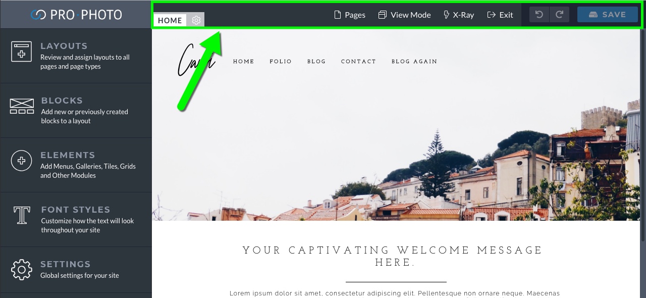
At the top of the screen, you are provided with the following information/options:
-
- Layout name – To the left, in the little gray box is the name of the layout that is being applied to the page you are viewing. You can click the gear icon to make some general appearance settings for the layout.
 Our layout tutorials have more details on what layouts are, and how they work.
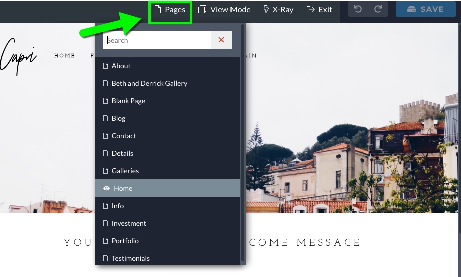
- Pages dropdown – Navigate to any of your other WordPress pages directly. This is helpful for viewing different pages that use different layouts.

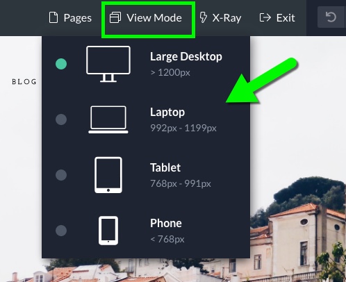
- View Mode – View how the page would appear on different device types (Desktop, Laptop, Tablet and Mobile). As you design and customize, you can confirm that you are getting the desired result on each screen size.

- X-Ray Mode – Highlight all blocks, rows, columns and/or modules in your layout. X-Ray is useful if you want to see exactly how elements are laid out, or if you want to see elements that may be hidden at certain screen sizes.
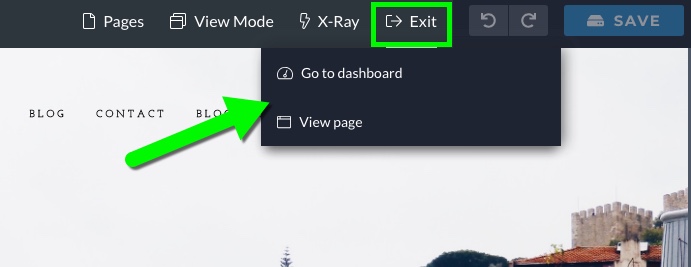
- Exit – Leave the Visual Builder to view the post/page directly, or go back to the WordPress dashboard.

- Undo/Redo – As you are working you can use these options to undo/redo any changes you’ve made since your last save. This is handy if you want to try something out to see how it looks, but decide to revert back to before your changes.

- Save – When the button is highlighted blue, you have unsaved changes – click to save your work and clear the “undo/redo” history.

I have some changes that need to be saved…
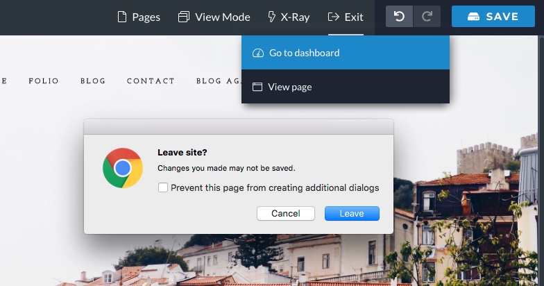
- If you ever try to navigate away from the page/post you are viewing before your changes have been saved, a pop-up warning will appear:

Oops, forgot to save my changes!

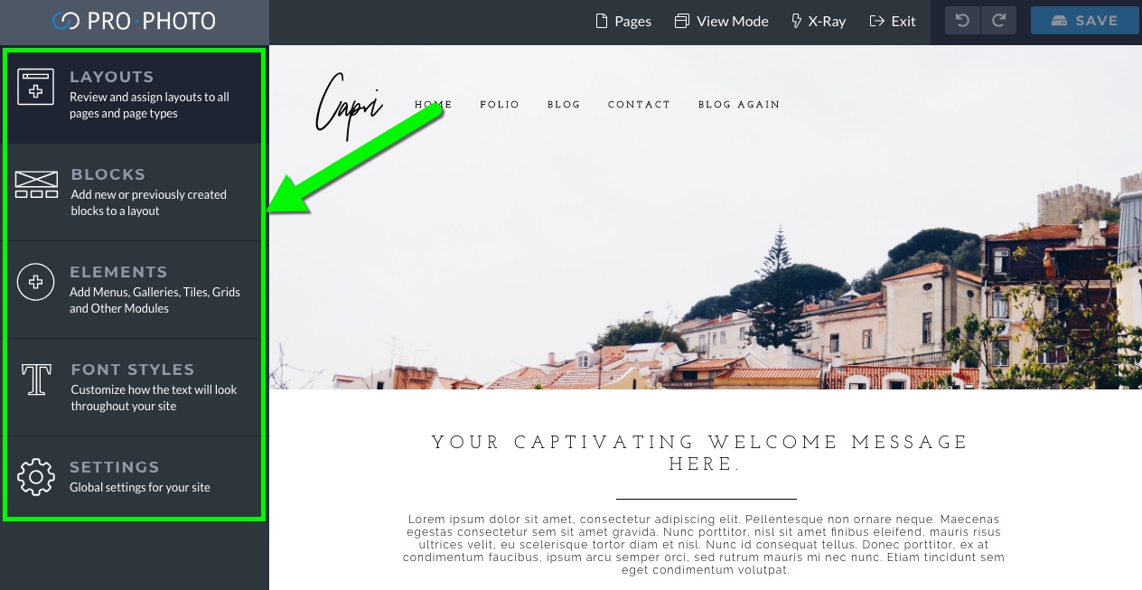
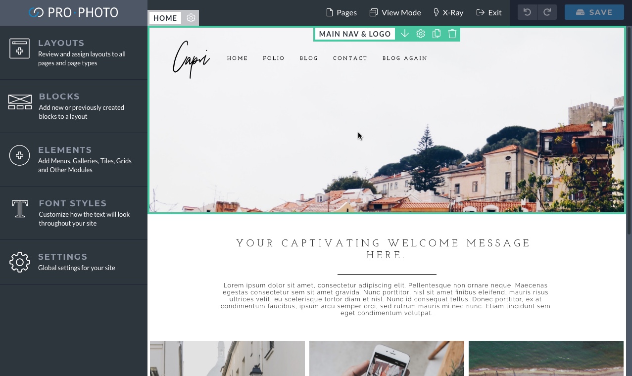
On the left-hand side of ProPhoto are five different main option areas that you will use as you customize your site.
As stated in our layouts guide, layouts are what provide style and arrangement to specific pages and/or overall page types. Layouts are what you will be creating and editing in ProPhoto.
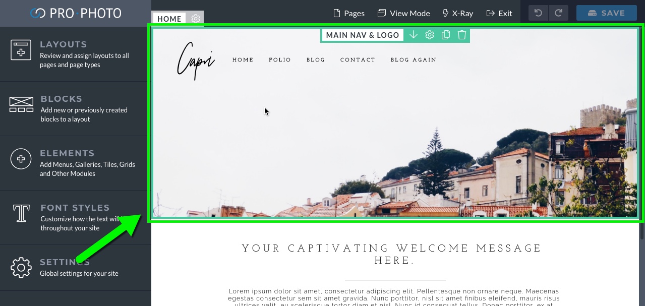
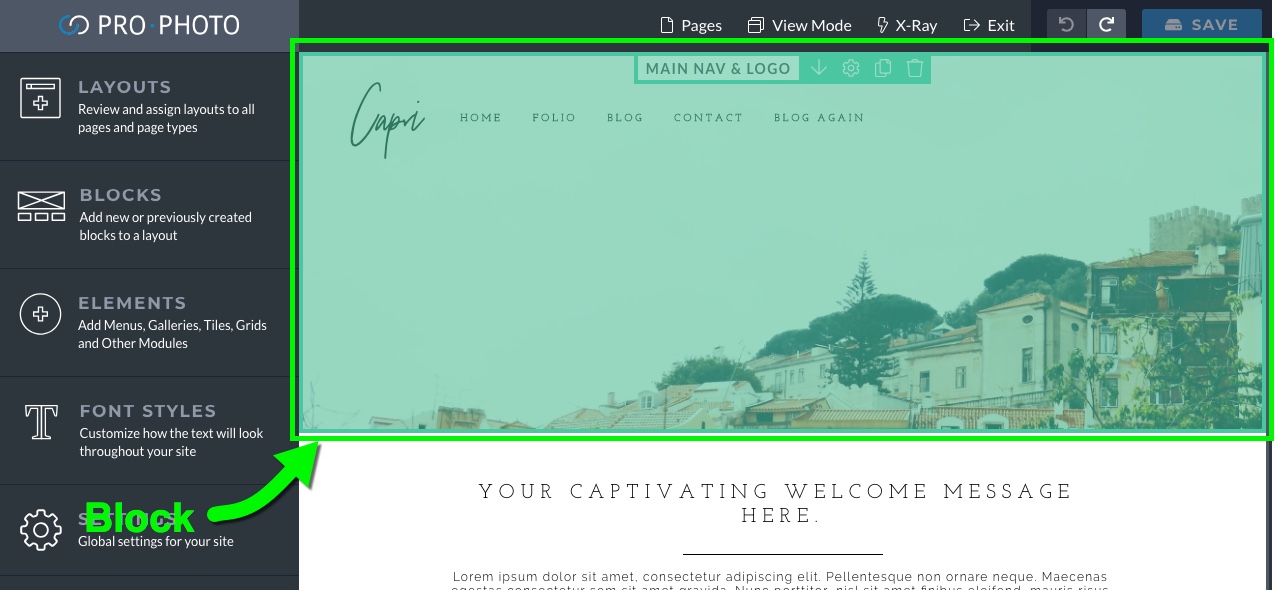
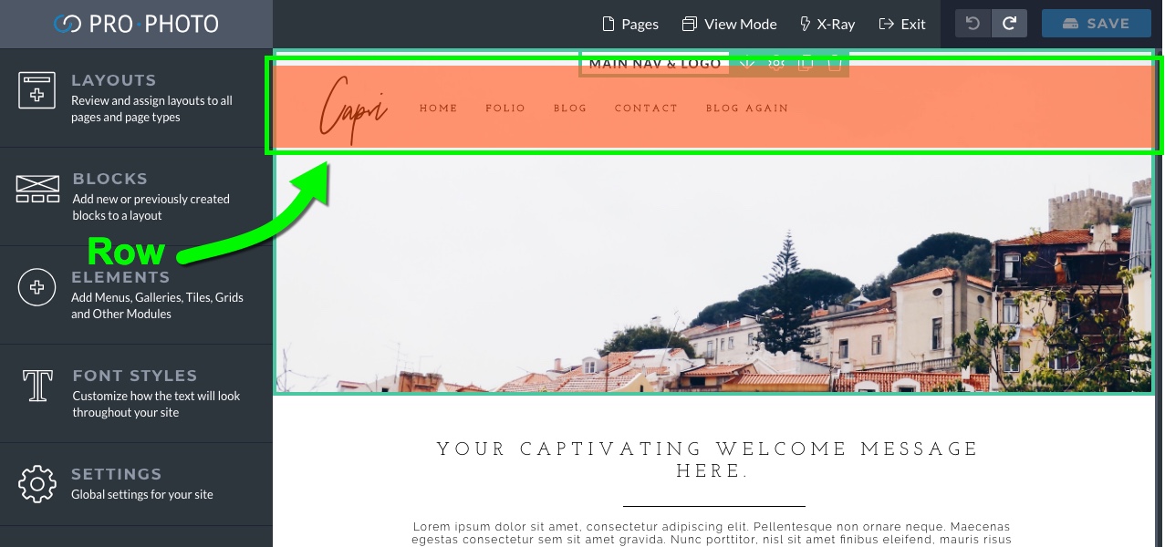
The structure of a layout is made up of 3 different components: blocks, rows, and columns.
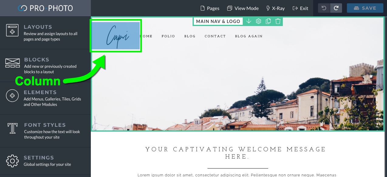
Blocks are the first component and contain rows. Rows are the next level item and contain columns. Columns are the smallest structural item within a layout and contain the actual content of the layout made up of modules.
You can use these three structural elements to create just about any type of layout that you want.




 Our
Our 