
Adding Rows/Columns
Rows and columns are powerful and flexible. They allow you to create unique displays within the layout you are customizing. To add a new row or column to a block within the Visual Builder, click to edit the block where you wish to add the row(s)/column(s). Then, in the Block’s Structure tab, use the “+” icons to add additional rows or columns.
Structure Options for Rows/Columns
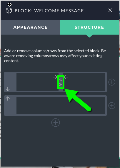
This Structure area also provides a number of other options related to your rows and columns. To change the widths of your columns, you can click the little arrow icons that appear between the columns:
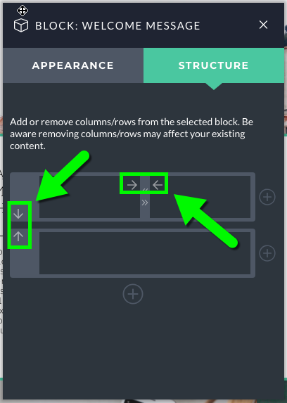
You can also click the larger arrows within the rows/columns to change their location:
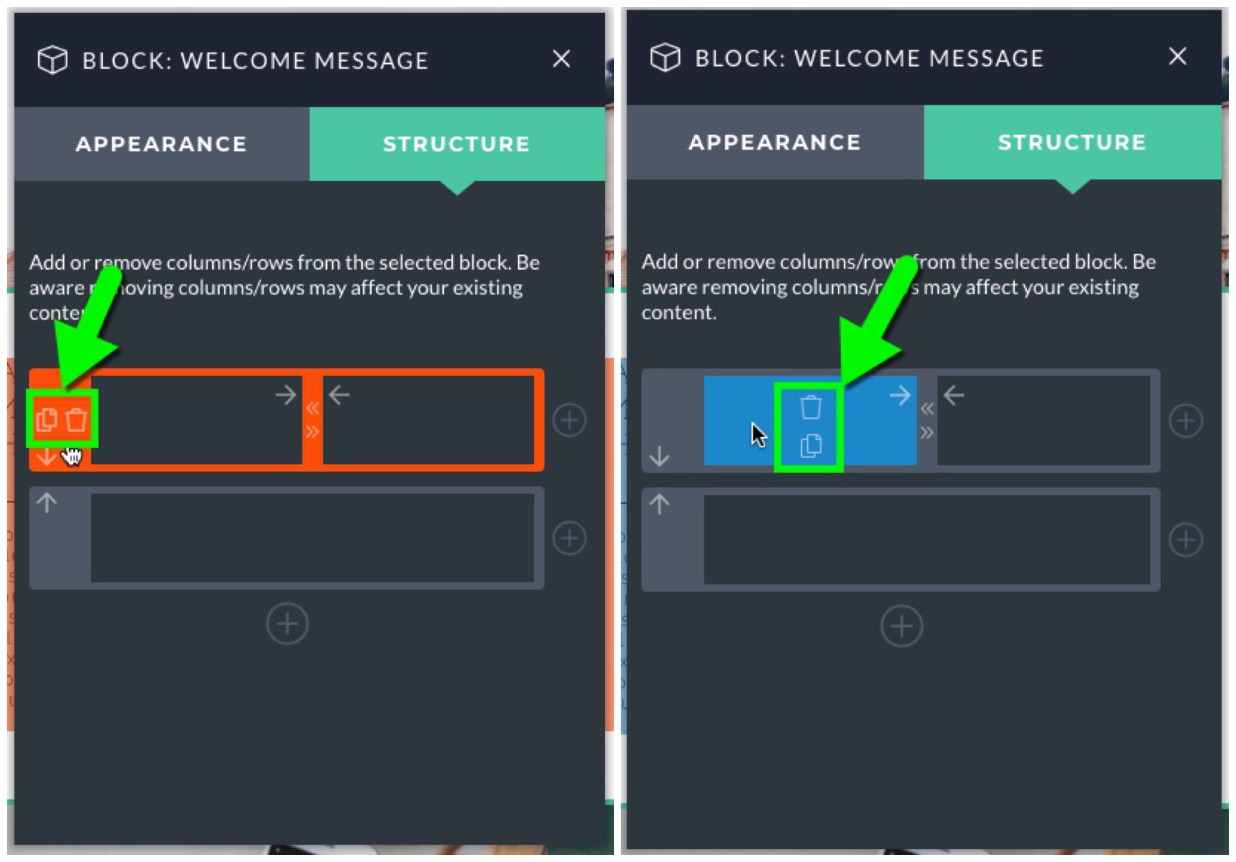
And if you hover over a row or column, you will see options to copy and delete:
Create as many as 6 columns in a single row and as many rows in a block as you like.
Styling Rows/Columns
Now as for styling the created rows and columns, select the “Appearance” tab within the Block’s editing options, and then click the gear icon on the row or column that you wish to edit:
Similar to the Appearance settings for blocks themselves, you can use the Appearance settings for rows and columns to add padding, background colors or images, borders or even Custom CSS code. However, there are a couple of unique Appearance settings for rows and columns that should be noted.
With regards to rows, you are provided the option of adding a row max width value, and set the breakpoint at which columns will begin stacking.
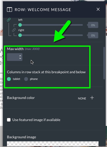
The Max width setting for rows is used when you want to ensure that the content within a row will never display beyond a certain width. One example of how this can be helpful is when a row contains a WordPress content module and the user wants to ensure that their text and images are the same width. If they are uploading images at 1000px wide and they want to constrain their text to the same width, they can set the row max width setting to 1000px and it will do just that. The column stacking setting is pretty straightforward. It just allows you to choose on which device types columns within the row will begin stacking vertically, rather than appearing side by side.
With regards to column appearance settings, there is one unique setting worth pointing out, Module vertical alignment:
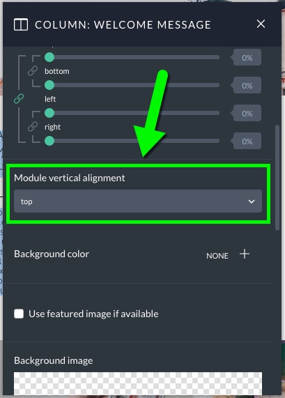
This setting allows you to choose how modules within a column will be vertically aligned, either at the top, center or bottom of the column.
Styling Multiple Rows/Columns at Once
If you want to apply the same styling options to multiple rows/columns at one time, you can easily do this with the ProPhoto Visual Builder. In the Appearance tab, hold down the Shift button on your keyboard (or Command on Mac or Control on PC) and click to select the rows/columns you wish to customize. After you do this, you’ll see the number of rows/columns selected at the top of the pop-up.
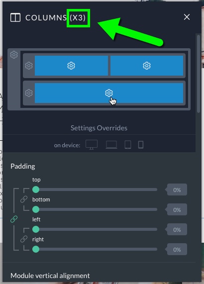
Whatever customizations you make will now be applied to all of the columns selected. This can be really helpful if you are wanting to add right/left padding or a background color to multiple rows/columns. That way you don’t have to customize each element individually.
Styling Rows/Columns for Different Device Breakpoints
Similar to styling blocks, when styling rows and columns, you are provided options for styling the row/column at different device breakpoints. Under “Settings Overrides”, click the device type you wish to modify for:
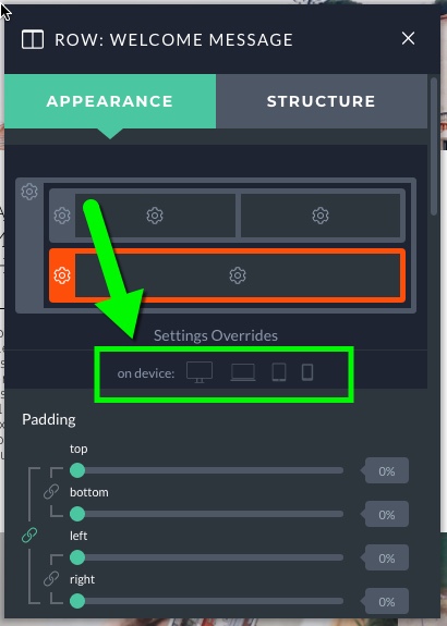
For for example, if we wanted to add some right/left padding to a specific row, but only on mobile devices, we would do the following:


