Each graphics widget provides a few extra options at the top:
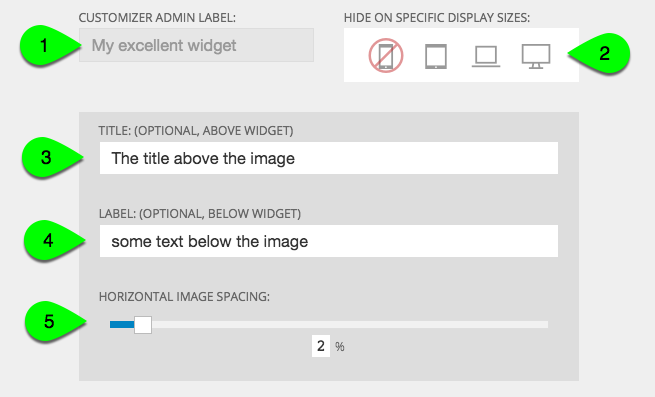
- Customizer admin label – this is only for your organization, since you’ll only see this label in the “Customizer > Layout” area in ProPhoto, and never on your site
- Hide on specific display sizes – hide individual widgets at certain browser sizes by clicking any of these buttons (mobile phone size disabled in the example above)
For more information on this topic, see our help about breakpoint visibility
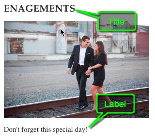
- Title (optional, above widget) – text entered here will appear above the widget (see example below) and will be styled by your widget font style headline settings
- Label (optional, below widget) – text entered here will appear below the widget and will be styled by your widget font style content settings – this example shows #3 and #4 text examples for title and label:
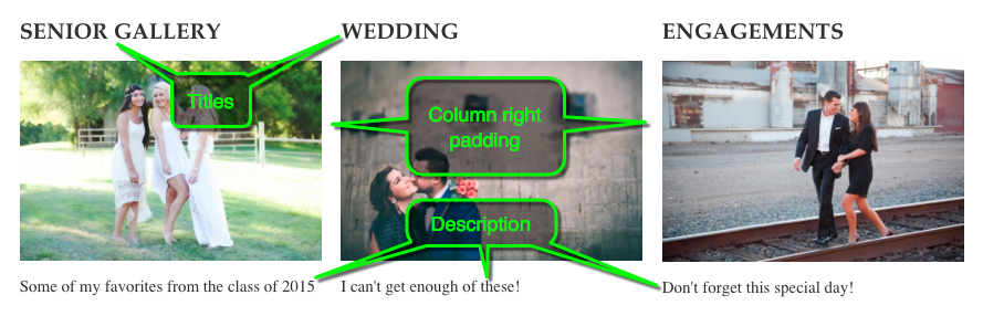
- Horizontal image spacing – spacing applies right margin to each image/tile when more than one are added in the widget – this example shows three images in one graphics widget, with the 2% spacing shown in orange between the left and center images:

three images in a single graphics widget with 2% spacing applied
Use the dropdown box to choose Image and upload an image from your computer. You may drag a file from your computer to the drop zone, or click inside the drop zone to use your computer file browser to locate your image.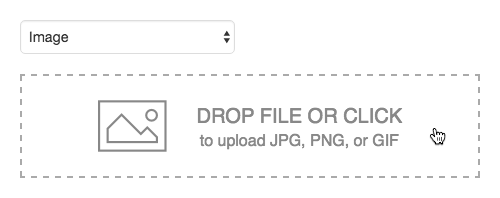 As mentioned, you may use images in JPG, PNG, or GIF (still or animated) formats. After uploading, your image has several options, seen and explained below:
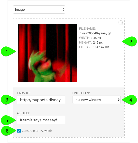
- Thumbnail – your image will be displayed in a small preview, along side…
- Image details – the filename used internally by ProPhoto, the original dimensions, and the filesize will all be shown for reference
- Links to – paste a URL link address into this box, and the image can behave as a clickable button, taking visitors to the link you’ve provided
- Links open – decide if your link should open in the same window (or tab) in your visitor’s browser, or if your link should open in a new window (or tab) instead
- Alt text – describe the image for the visually-impaired (optional) which may also be used for SEO
- Constrain to 1/2 width – this option is used to improve the appearance of images on high-density screens, including Apple devices featuring a Retina® display.
Check the box to display your image at half-size on normal displays, and high-density displays will use the higher resolution to display the image with greater clarity.
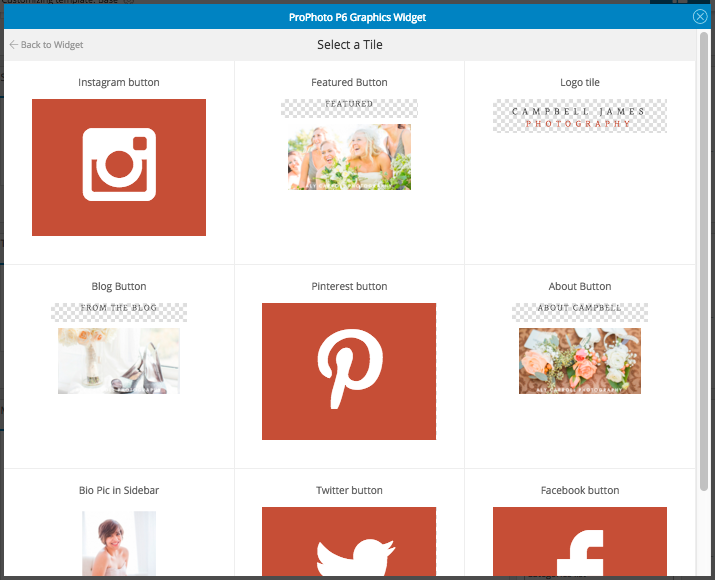
Learn about tiles if you have not created any in the “ProPhoto > Customizer > Tiles” area yet. Use the dropdown box to choose Tile and use the popup to select one.
Once a tile has been selected, you will see the options for your tile, shown and described below:
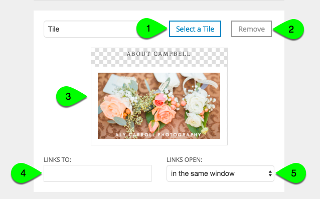
- Select a tile – if you have not selected a tile, or if you need to choose a replacement, use this button
- Remove – click this to remove the tile and it’s settings from the widget (the tile design itself will not be deleted)
- Links to – paste a URL link address into this box, and the tile can behave as a clickable button, taking visitors to the link you’ve provided
- Links open – decide if your link should open in the same window (or tab) in your visitor’s browser, or if your link should open in a new window (or tab) instead