
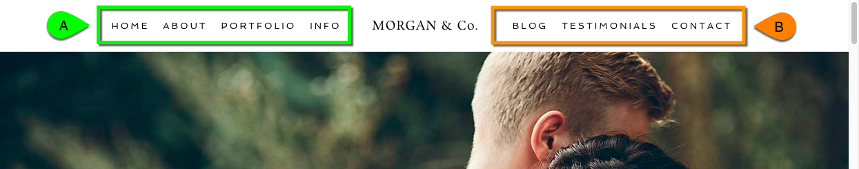
Typically, horizontal navigation mens take up a lot of space in your website layout. On a wide computer screen with lots of room that is just fine, but on a smaller screen in another orientation (like a phone or tablet) your menu may not fit very well. This is where a special mobile menu comes in handy, like this example:

As you can see, a special button can be used to expand a slide-out menu from the side of the screen. (you can even change to the right side, and you can swipe to show/hide on touch screens) This slide-out menu is hidden from view until needed, and looks attractive in a ‘tall’ browser orientation like a phone or tablet.
Go to this area to control several aspects of this special menu button and slide out pane:
“ProPhoto > Customizer (toggle top-left switch to “Template”) > Menus > Mobile”
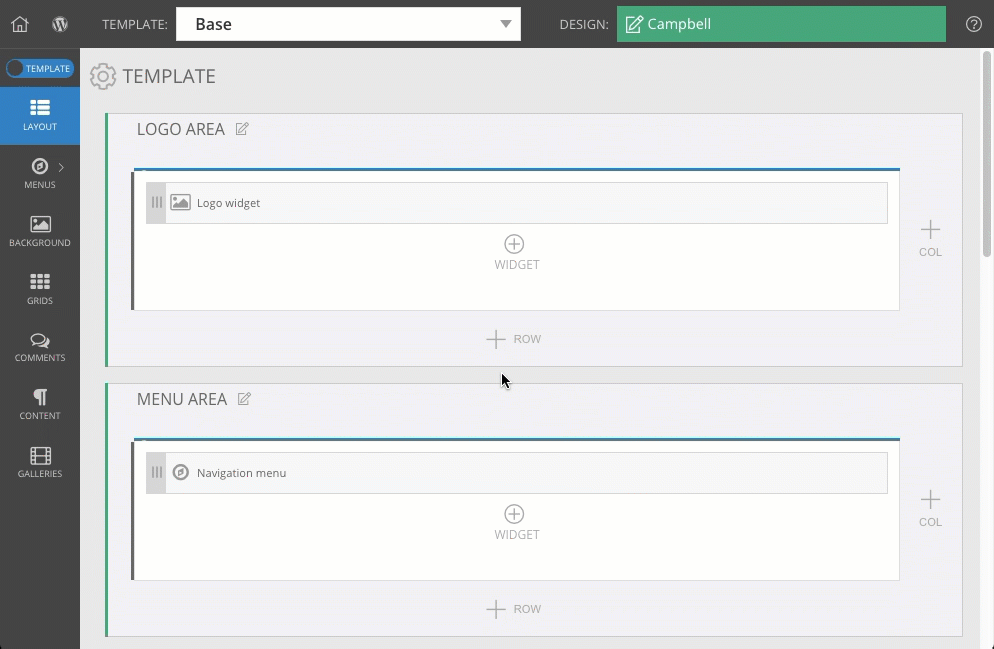
You may also want to select the top-level template along the top of your screen so the changes you make here are applied to all child templates in your design, shown as #3 in this screenshot:
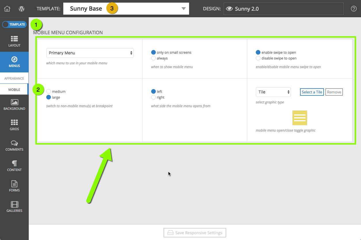
Using the controls in this area, you can choose:
- when this collapsed menu appears
(only smaller widths like phone and tablet, or always show) - whether swiping the screen will open the menu automatically or not
- which smaller width should be the trigger point
(medium = phone widths, large = tablet widths) - which side of the screen the button and slide-out menu appear
(left or right side) - which image or tile is used for the button
Refer to this screenshot above as you work through the sections below:
Hide the wide horizontal menu
Choose a menu structure
When the mobile menu button is shown
Enable swipe to open
Left or right side

Mobile button image or tile
Other mobile menu appearance options
To control the look & style of the mobile menu pane, text links, expanding sub-menus, and lots more, check out the companion settings area here:
“ProPhoto > Customizer > Menus > Appearance”
Our separate Modify menu appearance guide explains these options.


