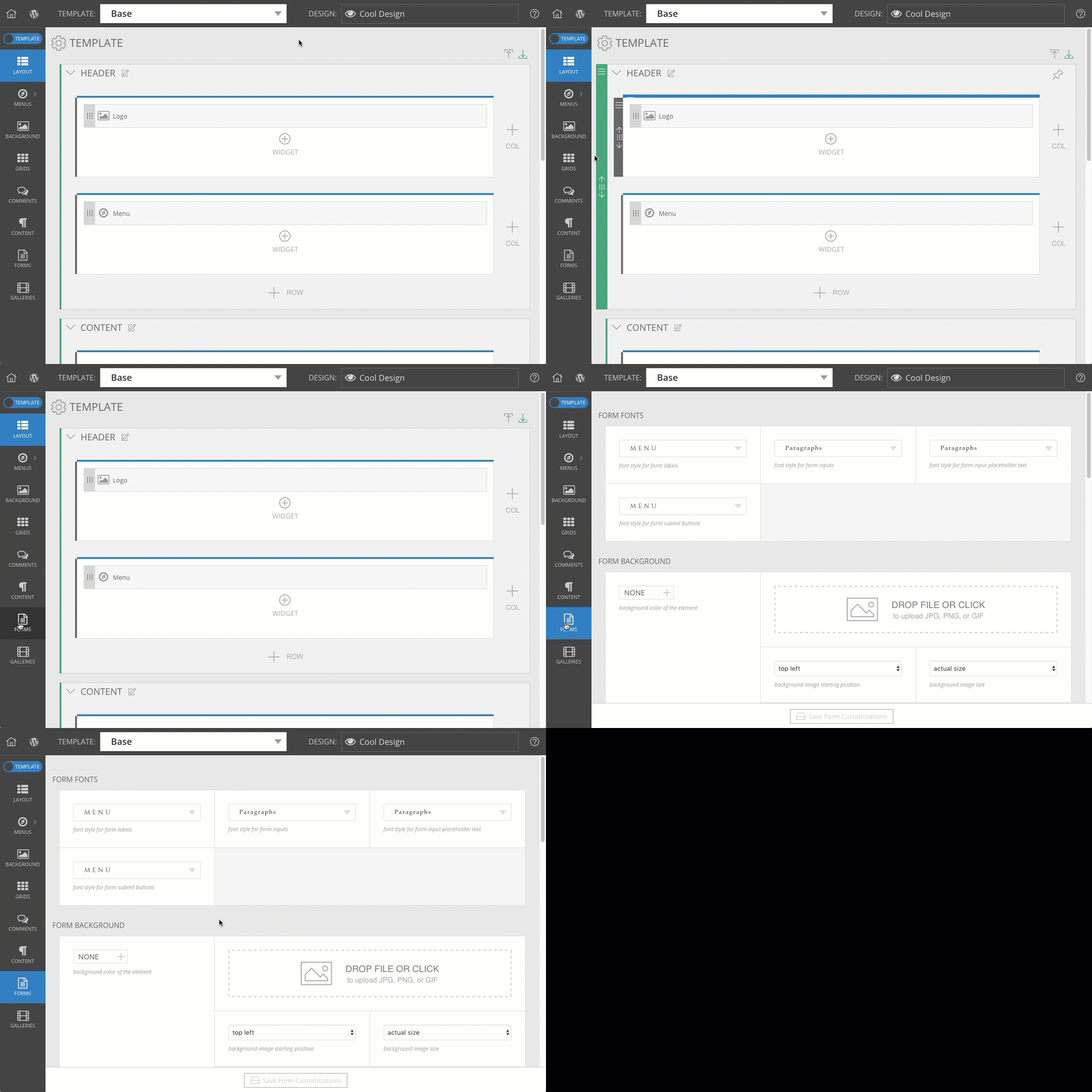
This section has dropdowns for the different parts of your forms where text appears.

Each of these corresponds to the different areas where text appears in your forms, seen in this example:
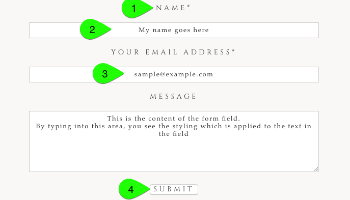
- The label for each form field will appear above each field.
- The form inputs control the style of the text which your visitors type into the fields.
- The placeholder text appears in a field before visitors begin typing their text.
- The submit button text appears below the form.
Select or create one of your Fonts & text styles
for each of these.
The background section allows you to apply a color or an image behind the group of form fields.
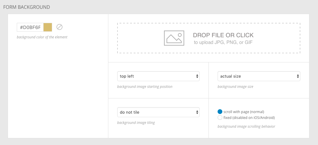
Using these controls, you can apply some style behind where your fields appear, as in this simple example:

For a full explanation of the position, size, tiling, and scrolling controls for background images, see our Background color and image
guide.
The form appearance section provides controls for the spacing surrounding the form fields, as well as alignment controls for the label text and the fields themselves.
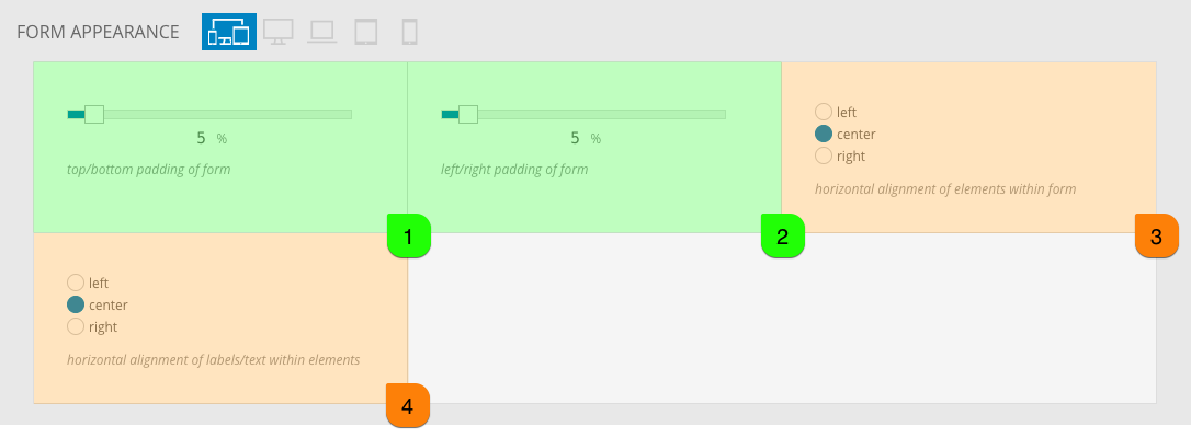 Seen highlighted in green above, these padding controls are used to provide space around the fields of the form. Highlighted in orange, the alignment controls alter the position of the field itself (3) and the label text for each field (4). When you choose to center-align a field, the text within that field is centered as well.
When a field is used at 100% width, the alignment will not be noticed because the field will fill the entire width of the area. To alter the width of fields, edit the field itself in the “ProPhoto > Customizer > (toggle top-left switch to “Design”) > Forms” screen. Our Create a form
guide explains how to adjust the width of individual fields in a form.
And to adjust the padding between fields, or the space around the text within the fields, see the field spacing help, below.
The form element appearance section provides controls for the look of the fields.

Using these controls, you can adjust the border thickness, color, and style which surrounds the edges of the fields.
You can also set a background fill color for the fields, seen behind the text which is typed into the fields.
Lastly, you can adjust the corner radius of the fields, if you want a rounded corner appearance.
The form element spacing section provides controls for the padding inside form fields, as well as the vertical spacing gap between fields and between field labels.

Using these controls, you can add gap between the border edge of a field and the text filled into the field.

You can also control the gap between labels and fields, as well as between fields and the next field.

The spacing you select will be applied consistently throughout the form – it is not possible to create different spacing for specific fields or their labels.
The form element validation appearance section gives you controls for the highlight glow when a field is selected, as well as when a field has an invalid entry.

The first color is applied as a highlight glow around a field when it is selected for typing, and the second color & font style are used when a field is filled with invalid text. Invalid fields include fields which are required but left blank. See this video clip for an example:
If you want to change the phrase that is used when a field is invalid or empty, see this area:
“ProPhoto > Settings > Site Settings > Forms”
The form submission appearance section provides controls for the color of the overlay and messages seen during and after the form is submitted.

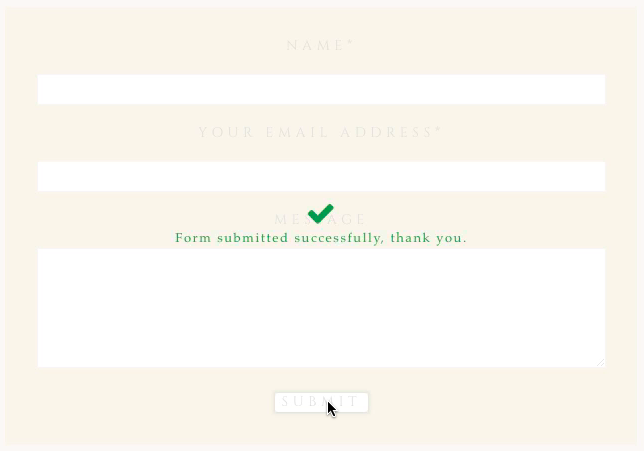
For example, here is a ‘success’ message, shown after the form has gone through:

Use the color controls to alter the color and opacity of the overlay, as well as the message text seen after submission.
To change the phrases that are seen, see this area:
“ProPhoto > Settings > Site Settings > Forms”


 Seen highlighted in green above, these padding controls are used to provide space around the fields of the form. Highlighted in orange, the alignment controls alter the position of the field itself (3) and the label text for each field (4). When you choose to center-align a field, the text within that field is centered as well.


